Shop Controller
Defining + Strategy
The Problem
ShopController is a startup focused on helping auto shops manage their operations more efficiently. Auto shops face significant challenges with paperwork management, which leads to budget leaks and inaccurate inventories. The goal was to create an application that would serve as a digital repository to accurately track vehicles, jobs, technicians, and hours worked, enabling shop owners to make informed decisions for growth and operational efficiency.
Entering a competitive market posed considerable challenges:
ShopController needed to distinguish itself from existing companies offering similar services
The visual branding needed to position ShopController as an industry leader
The target audience required careful identification, focusing on specific personas rather than demographics
Management systems stuck in the stone age
Fragmented workflows causing daily headaches
Analytics that belonged in a museum
User experiences designed by committee
Behind the scenes look at part of the Define™ process:


Design + Deliver
The Solution
Brand Strategy Development
I developed a comprehensive brand strategy centered on ShopController's core values:
Simplifying operations for auto shops
Empowering businesses with actionable data
Providing a professional and reliable service
Target Audience Identification
Rather than targeting by gender, I focused on connecting with three distinct personas:
Shop Owners/Operations - Needing detailed metrics and data for strategic decision-makingService
Writers/General Managers - Managing job intake and customer interactions
Automotive Technicians - Requiring simple interfaces to track time and provide job updates
Visual Identity Design
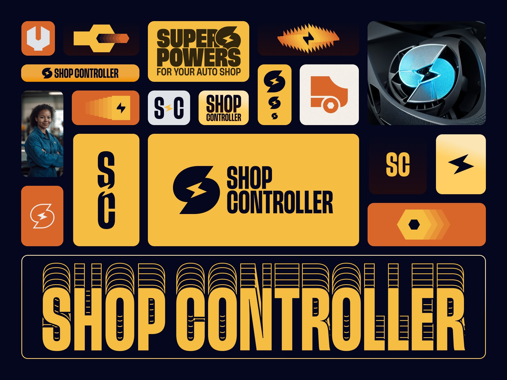
The visual identity was designed to be clean yet bold, with key elements including:
A color palette featuring yellow and dark tones that echoed automotive design aesthetics
A logo incorporating two C shapes forming an S with a lightning bolt, symbolizing power and efficiency
Condensed uppercase typography to accommodate the length of the brand name while maintaining impact
A visual language system with icons and design elements that conveyed motion and agility
Brand Positioning and Storytelling
I positioned ShopController through compelling storytelling:
Tagline "Power On" and concept of "superpowers for your auto shop"
Positioning the shop team as heroes in their journey toward efficiency
Creating a narrative around tackling the chaos of paperwork and financial leaks
Website Design Implementation
The website design featured:
A flexible system adapting to both light and dark modes
Dark mode for product-specific pages (using yellow accents)
Light mode for tertiary pages like blogs and about sections (using orange accents)
A modular design system allowing the ShopController team to implement various content sections
Comprehensive guidelines using an 8-pixel spacing system and modular typography scale
A "website kitchen sink" with pre-designed components for testimonials, heroes, and blog posts
Measurable Impact:
Successful deployment across 30-40 demonstration sessions with future power users
Seamless integration with multiple third-party automotive systems
Transformed scattered paper processes into streamlined digital workflows
Enthusiastic user adoption with minimal training requirements
The result? A comprehensive digital ecosystem that transforms auto shops from technological laggards into digital leaders. The unified experience across web and mobile platforms ensures that whether users are scheduling appointments online or managing repairs in the shop, they're wielding the same powerful tools with confidence and ease.


