A photo of an iPhone screen with two text messages in a chat bubble. The first message says " You Were mesa the day, thank you!" and there is also a small pink heart emoji above it. There's another emoji below that reads 'OMG'. A young woman wearing black apron stands next to her cafe store icon on social media profile page. It’s a simple and minimalistic design with neutral tones and subtle gradients.
Logo design for "webmo deluxe" app, featuring two clean and minimalistic color icons in pink orange black and white on top of the minimalist macos web search bar. The icon should have an aesthetic similar to Apple's i clang logo, with simple shapes and flat colors. It must convey a sense of modernity while maintaining simplicity. Use a neutral background that highlights the vibrant colours of each symbol without any text or letters.
The logo consists of an abstract, stylized shape and the text "webmo". It is a logo for an online platform called "webmo" with a color palette of pink and orange, a solid background, and a simple, minimalistic design. The logo features white letters on a colored background and is created using vector graphics.

Meaningful branding
for a purpose-led
web developer.

Meaningful branding
for a purpose-led
web developer.

Meaningful branding
for a purpose-led
web developer.

TYPE OF WORK

TYPE OF WORK

Brand Strategy, Logo
Visual Branding, Collateral.

Brand Strategy, Logo
Visual Branding, Collateral.

Brand Strategy, Logo
Visual Branding, Collateral.

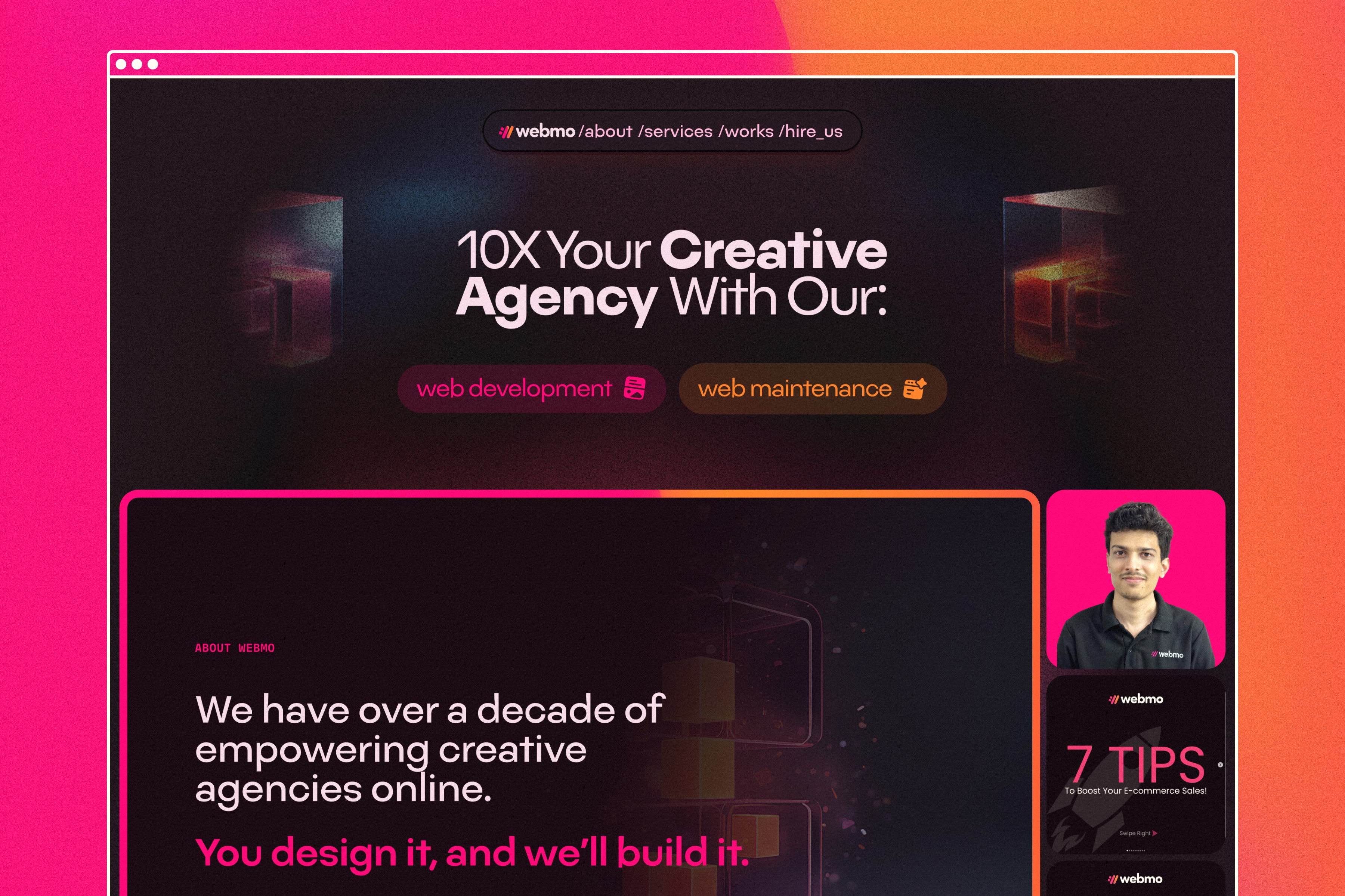
a website landing page for " ten x your creative agency with our web development, graphic design and digital marketing services" using pink orange black gradient background, the hero section should have an Instagram post of male designer wearing business casual attire in front of his computer screen showing off some designs. below it is written text that says "we – we – need you! You design it, And we'll build it." there's also text on top saying "7misseasy Rifts Mondays " which was just used as illustration. under him were images of creative work space, and at bottom left corner he had an youtube play button icon and video title below

DEFINE

DEFINE

Shaping and uncovering gems.

Shaping and uncovering gems.

Moin from Webmo approached Tim Preut Design to create a new brand identity. His current logo and color palette were outdated and did not effectively communicate his values.

A strategy session was first conducted to define three core elements: Webmo’s why, what, and who.
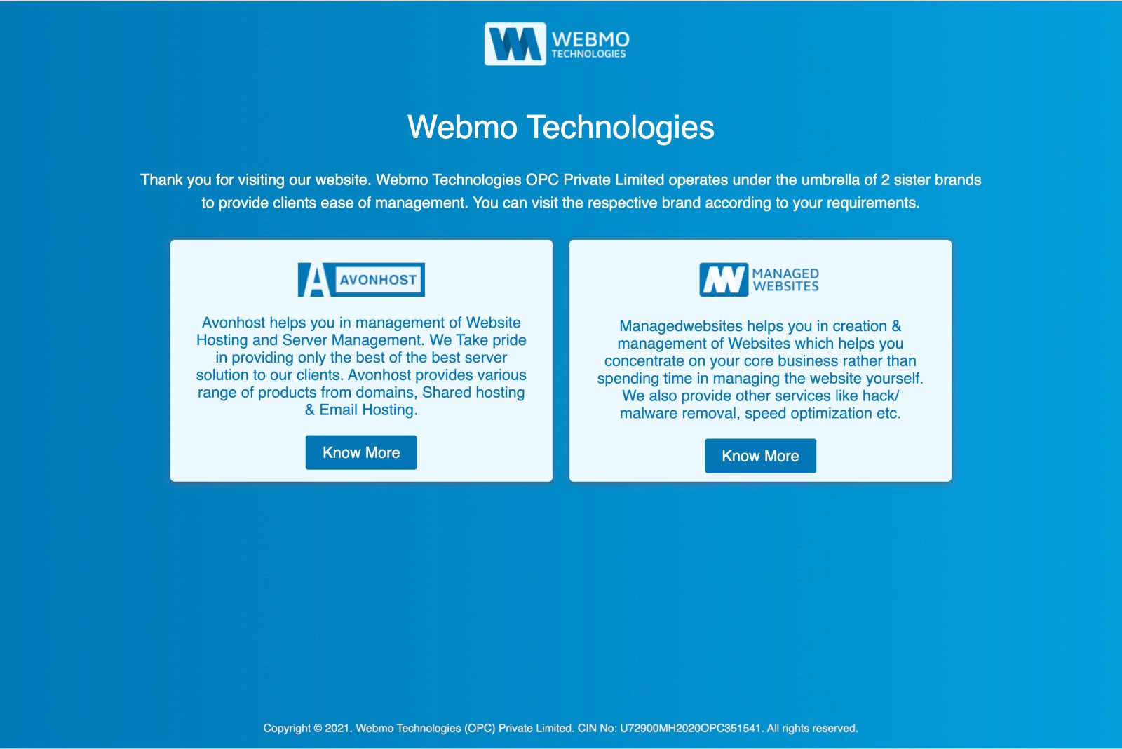
Moin from Webmo approached Tim Preut Design to create a new brand identity. His current logo and color palette were outdated and did not effectively communicate his values.

A strategy session was first conducted to define three core elements: Webmo’s why, what, and who.

~ The before Tim Preut Design state of Webmo

~ The before Tim Preut Design state of Webmo

Webmo's Why

Webmo's Why

Moin is passionate about helping his clients have the best website for their business. He focuses on creating websites that function properly and support his clients' success. Moin has extensive experience and success in the WordPress space.
Moin is passionate about helping his clients have the best website for their business. He focuses on creating websites that function properly and support his clients' success. Moin has extensive experience and success in the WordPress space.

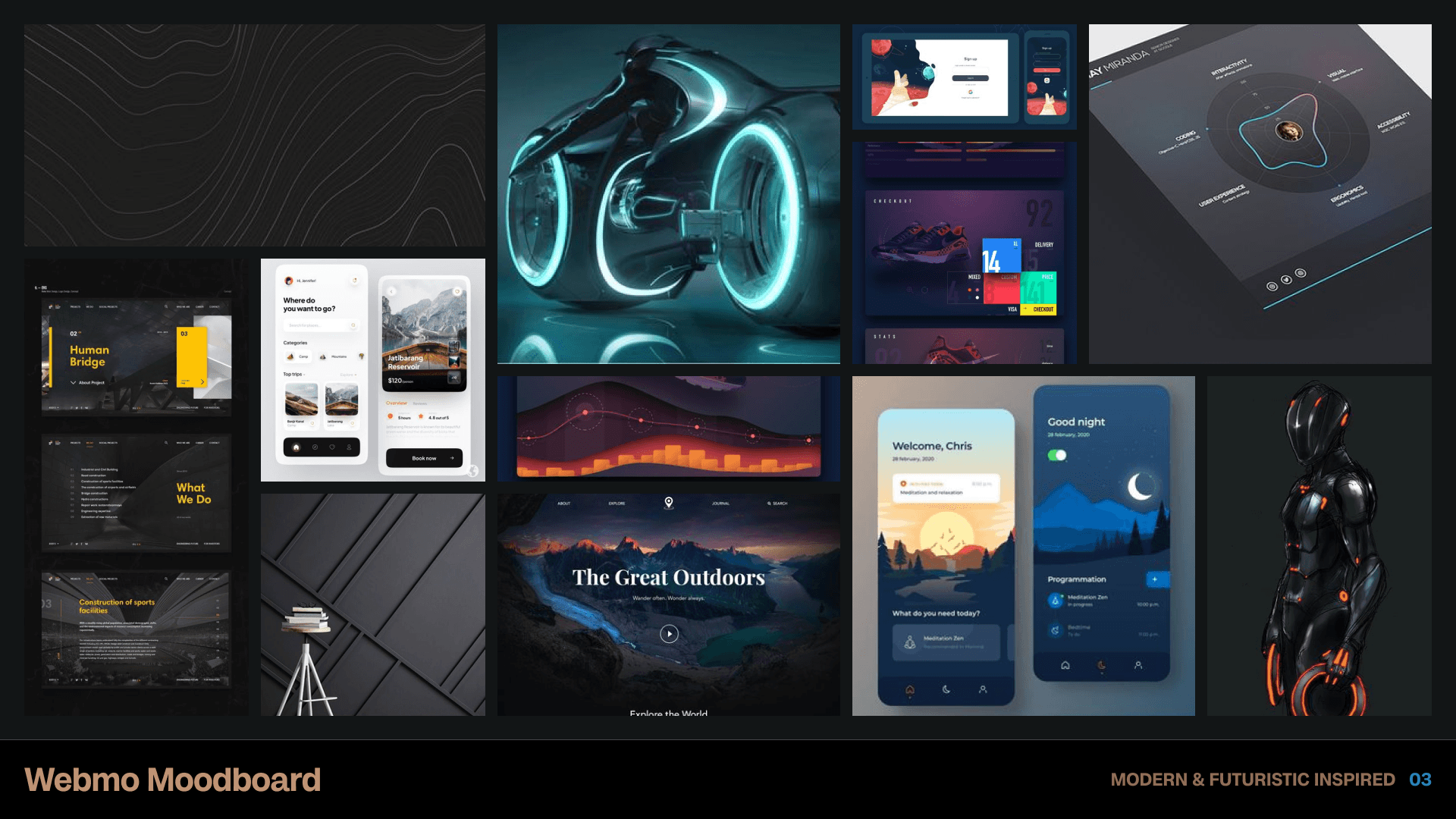
A web design mood board for the "Modern & Futuristic Outdoors" mobile app, showcasing sleek UI designs and dynamic layout ideas with elements like motorcycle illustrations, high-tech icons, vibrant color palettes, digital interface screens, all on an elegant black background. The mood board is presented on a large canvas, allowing designers to showcase 20 different web page images, each displaying unique user interface typography and text displays.

~ Moodboard development around the WHY and WHAT for Webmo

~ Moodboard development around the WHY and WHAT for Webmo

Webmo’s Unique Selling Points

Webmo’s Unique Selling Points

From our strategy meetings I was able to develop and identify these following points as being Webmo's superpowers:

  • Genuine passion: Each project is treated with importance, professionalism, and a commitment to getting the job done right.

  • Extensive experience: Webmo has a vast knowledge base and skill set within WordPress, setting them apart from their competition.

  • Small, focused team: As a small team, Webmo ensures honesty and quality by never taking on more than they can handle.

Webmo’s What

Webmo’s What

Moin enjoys performing one-off tasks for WordPress, particularly those crucial to clients, such as fixing broken websites and ensuring e-commerce functionality. These tasks help develop relationships, leading to Webmo becoming the go-to source for website issues or management.
Moin enjoys performing one-off tasks for WordPress, particularly those crucial to clients, such as fixing broken websites and ensuring e-commerce functionality. These tasks help develop relationships, leading to Webmo becoming the go-to source for website issues or management.

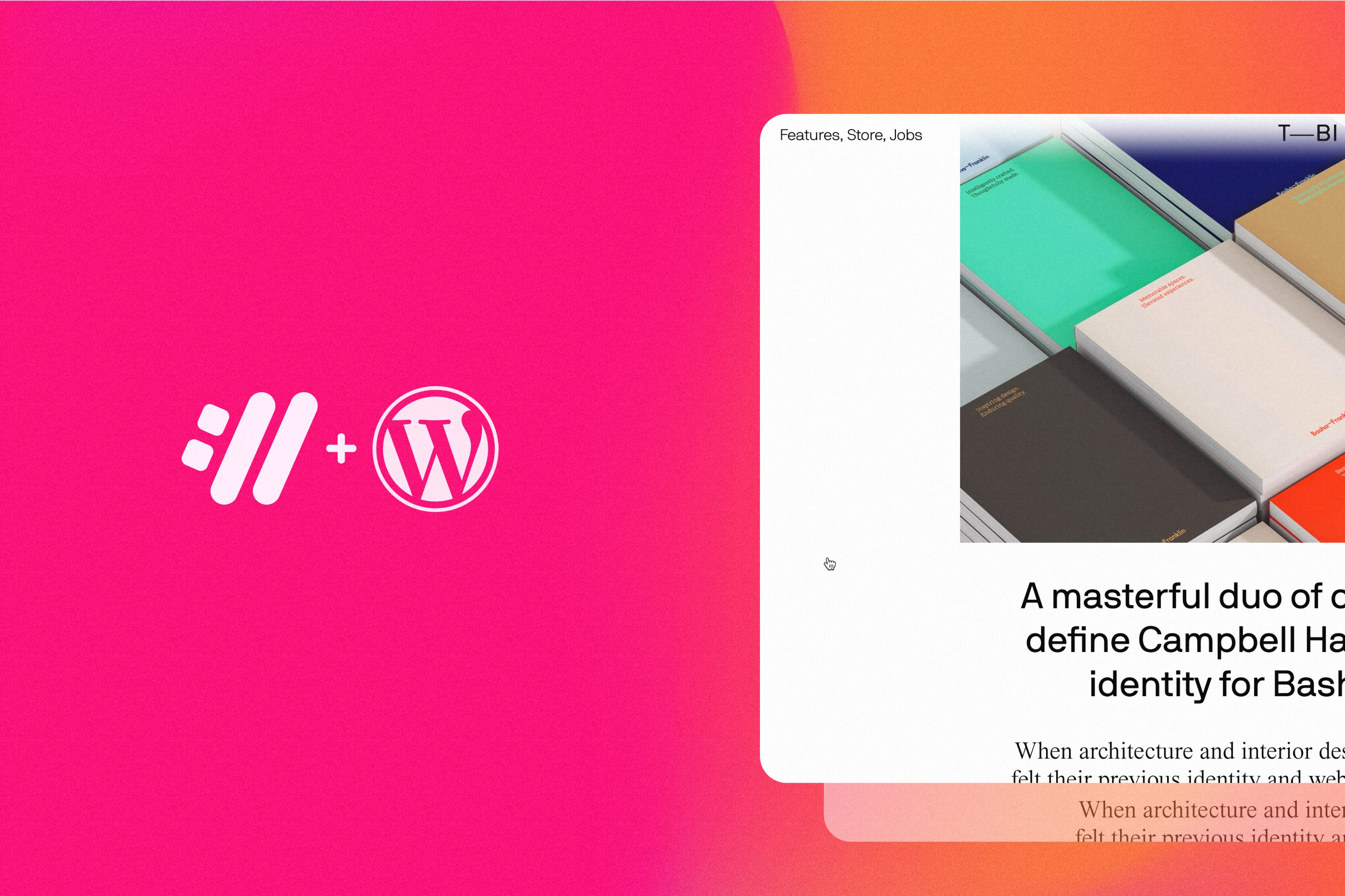
Features a story focused on architecture and interior design for Basile's modern website. The graphic features a pink gradient background with white text that says "Masterful duo of Campbell Hograph and Lily Basil" as a wordmark logo, prominently displayed in the middle of the screen with high contrast and bold typography.

~ Webmo plus WordPress is a superpower.
~ Webmo plus WordPress is a superpower.

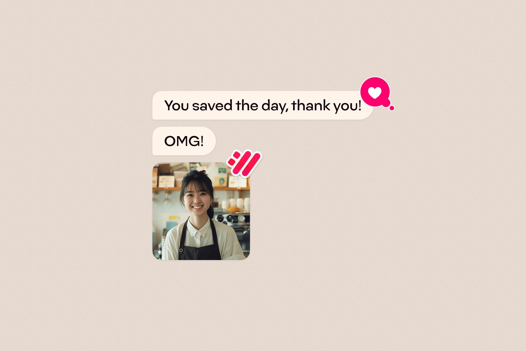
A photo of an iPhone screen with two text messages in a chat bubble. The first message says " You Were mesa the day, thank you!" and there is also a small pink heart emoji above it. There's another emoji below that reads 'OMG'. A young woman wearing black apron stands next to her cafe store icon on social media profile page. It’s a simple and minimalistic design with neutral tones and subtle gradients.

~ A still from an ad made for Webmo. You can see the full ad below ⬇️

~ A still from an ad made for Webmo. You can see the full ad below ⬇️

~ A quick ad that was made for Webmo

~ A quick ad that was made for Webmo

Webmo’s Who

Webmo’s Who

Webmo is an India-based company targeting US-based entrepreneurs and business owners with WordPress websites, often with an e-commerce focus. Moin aims to ensure his company is viewed with the highest integrity and esteem, not just another outsourcing firm.
Webmo is an India-based company targeting US-based entrepreneurs and business owners with WordPress websites, often with an e-commerce focus. Moin aims to ensure his company is viewed with the highest integrity and esteem, not just another outsourcing firm.

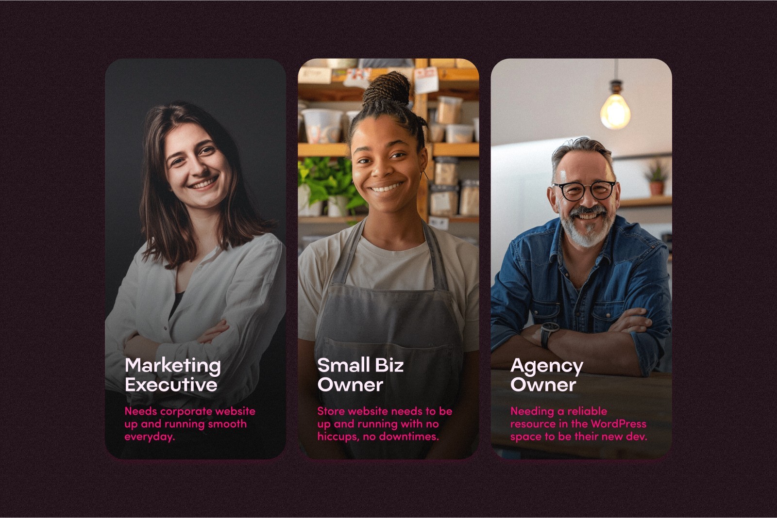
Three panels  Containing three human beings. In the first panel, a white marketing professional. In the second panel, a black woman baker. In the third panel, a white male wearing glasses, older agency owner. The panels each contain a lifestyle photographer. style and containing words that describe the person's job and description.

~ An idea of Webmo's target audience.
~ An idea of Webmo's target audience.

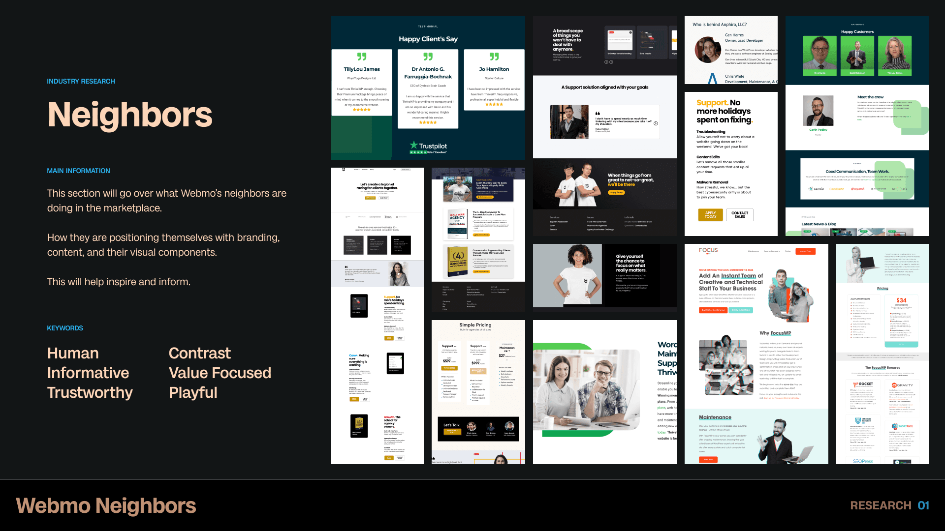
A slide from a branding deck that focuses on research and the neighbors of Webmo. It shows screenshots in a mood board style of the different neighbors' websites along with text that describes the websites and overall visual aesthetic of the neighbors' mood board.

~ Moin is up against stiff competition with his business.

~ Moin is up against stiff competition with his business.

Our big challenge

Our big challenge

Moin was very self conscience in two important areas.


  • Hi appearance. He did not like to be seen or his face public.
    Basically, he was shy.

  • His worry about he he will be perceived by an American audience.

I worked really hard in boosting his self confidence to show himself. I too have a shyness issue, but realize the immense benefits of connecting a face to a visual branding:


  • It adds an element of trust.

  • First impressions count.

  • The idea that your client feels rest assured that they will be dealing with a friendly human goes a long way to them hiring you. His worry about he he will be perceived by an American audience.


Then, we worked on the perception issue. I helped him develop a strategy to appeal to the American audience along with not allowing himself to sell his services for cheap because of a currency gap. I really tried to drive home that he is worth every penny he wants to charge. The strategy was to speak to benefits in Webmo's service. At the end of the day, no matter where you are from, if you found a solution to your problem that you feel confident in, you will want to go with that solution.


By working through these challenges, it helped Moin build confidence in his business offerings, himself, and getting himself out in the public eye. The benefits from this exercise alone, may be worth more than the visual identity ROI. I was proud of us!

DESIGN

DESIGN

Designing to communicate USP’s

Designing to communicate USP’s

The design process began with iterating on logo concepts, focusing on creating a simple, impactful, and communicative logo icon. After numerous concepts, the options were narrowed down to eight or nine, which were then presented to Moin.


This early collaboration allowed for valuable feedback and further discussion.

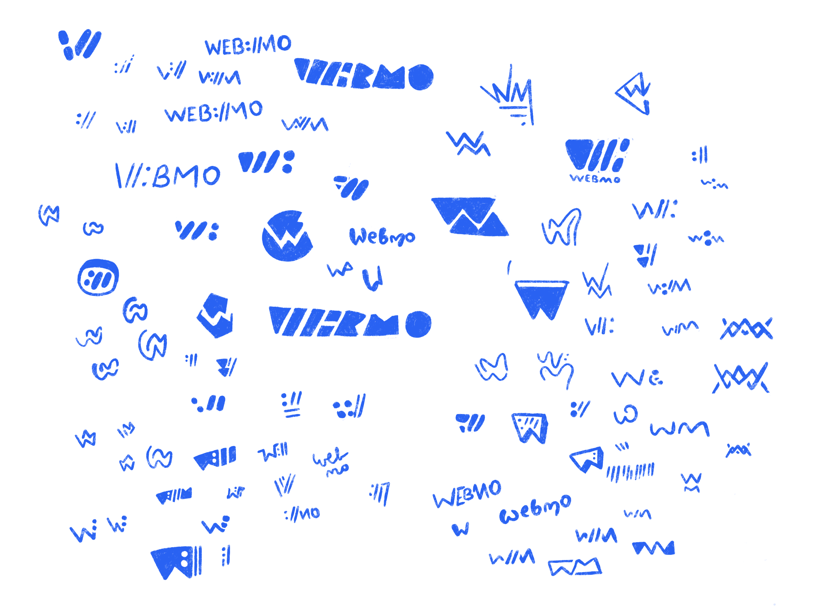
A screenshot of sketches for Webmo logo. Some of the sketches contain W's and M's in funky styles, many W's in geometric, and some word marks.

~ Keep sketching!

~ Keep sketching!

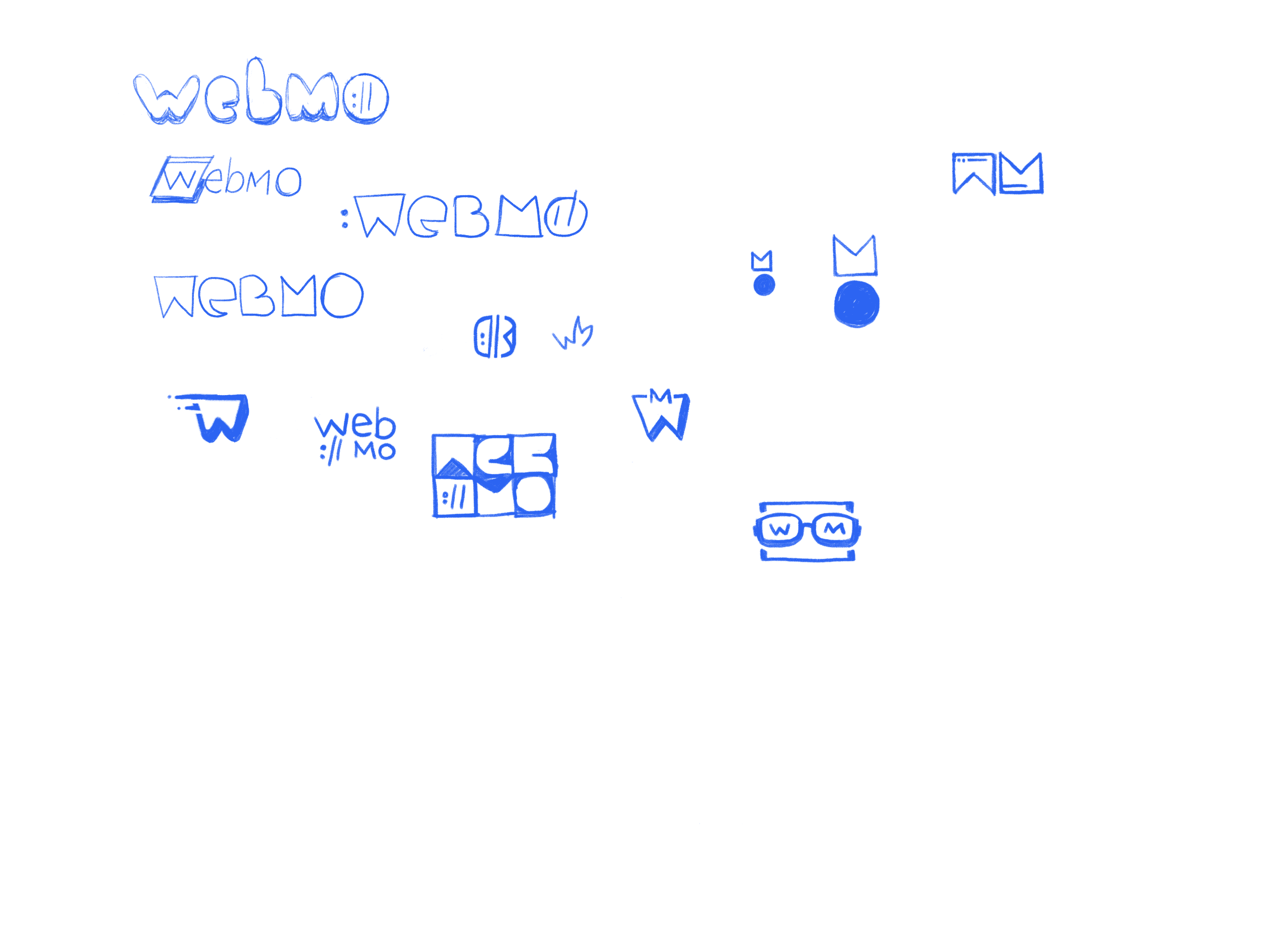
A screenshot of some logo ideas and sketches from Procreate. In this screen there is not as many sketches, but there is an emphasis on wordmarks and icons.

~ Fun sketches and options. Exploration is key!

~ Fun sketches and options. Exploration is key!

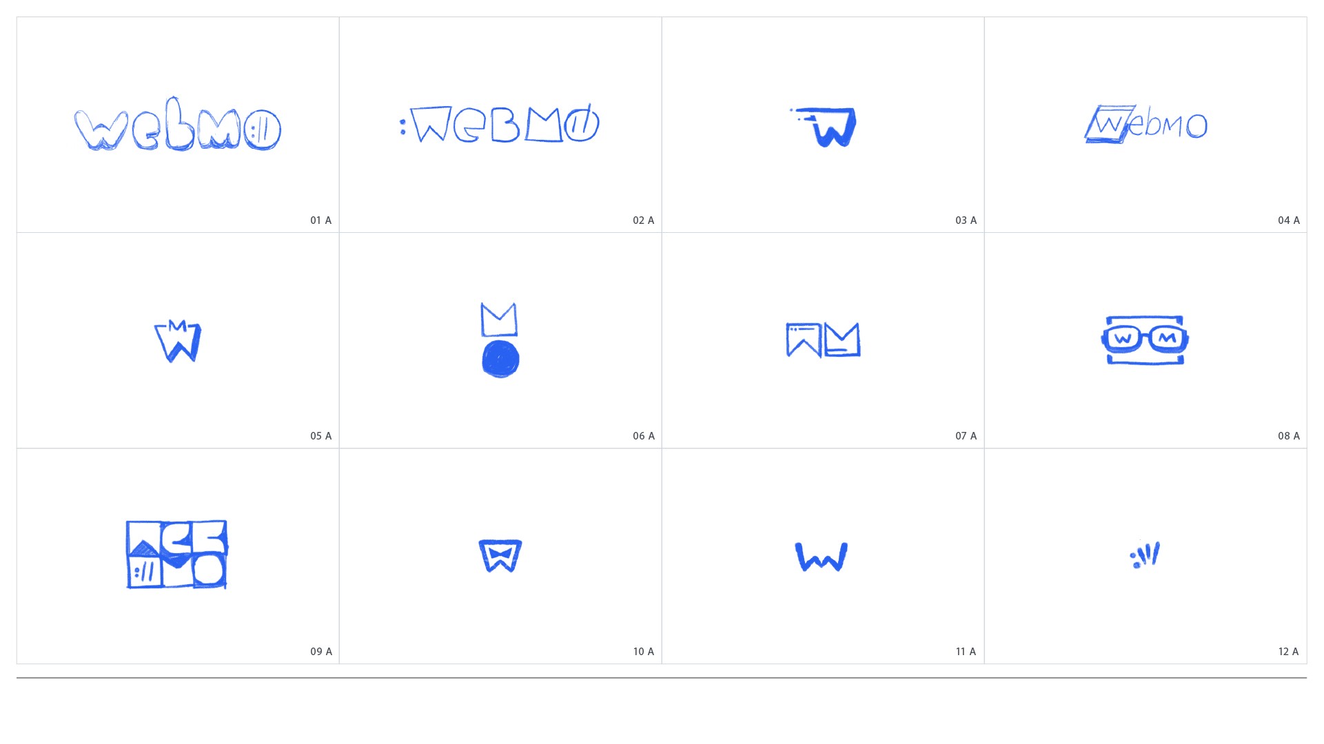
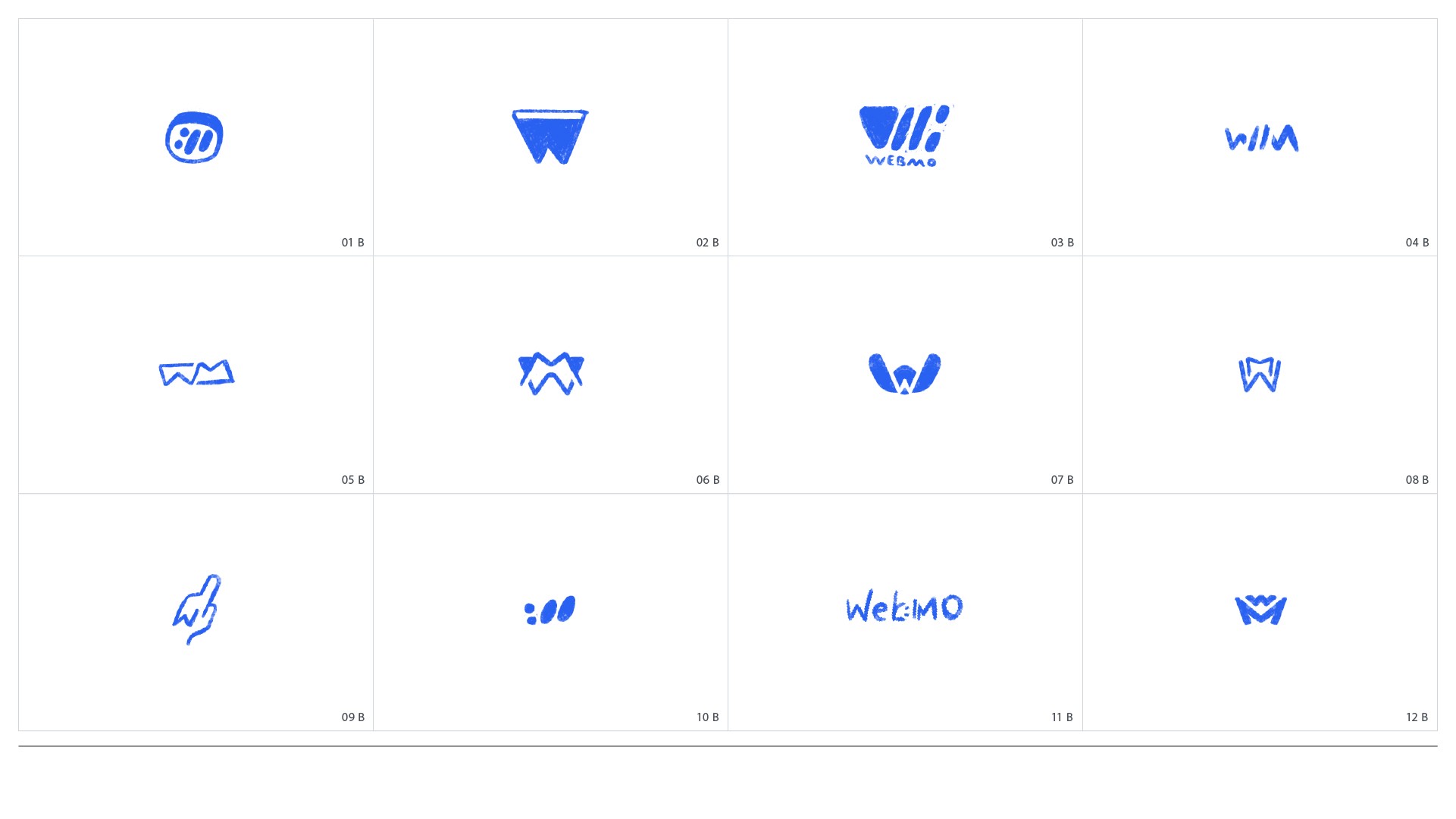
A grid of logo sketches for presentation to show Moin that were created in Procreate.

~ Some finalized sketches that I presented to Moin.

~ Some finalized sketches that I presented to Moin.

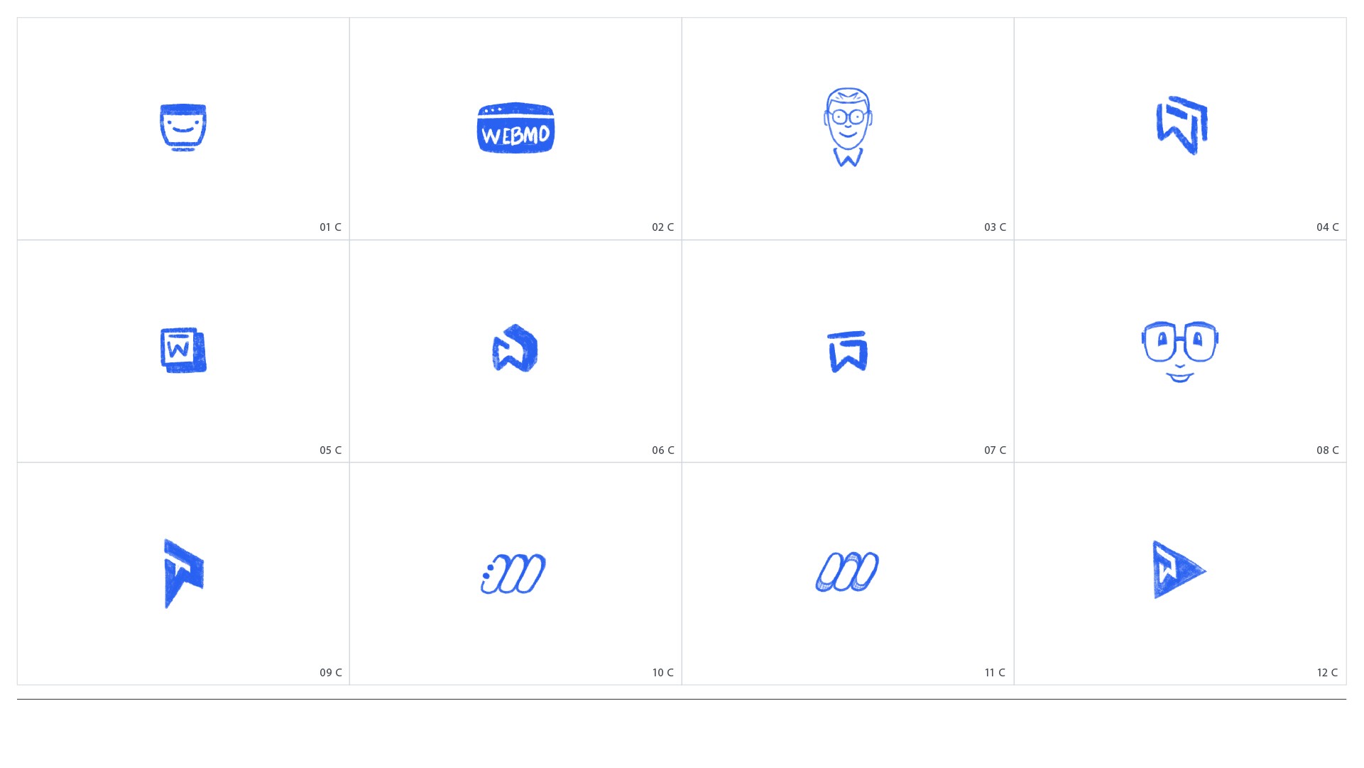
A grid of logo sketches for presentation to show Moin that were created in Procreate.

~ More really solid options playing on the W and the M.

~ More really solid options playing on the W and the M.

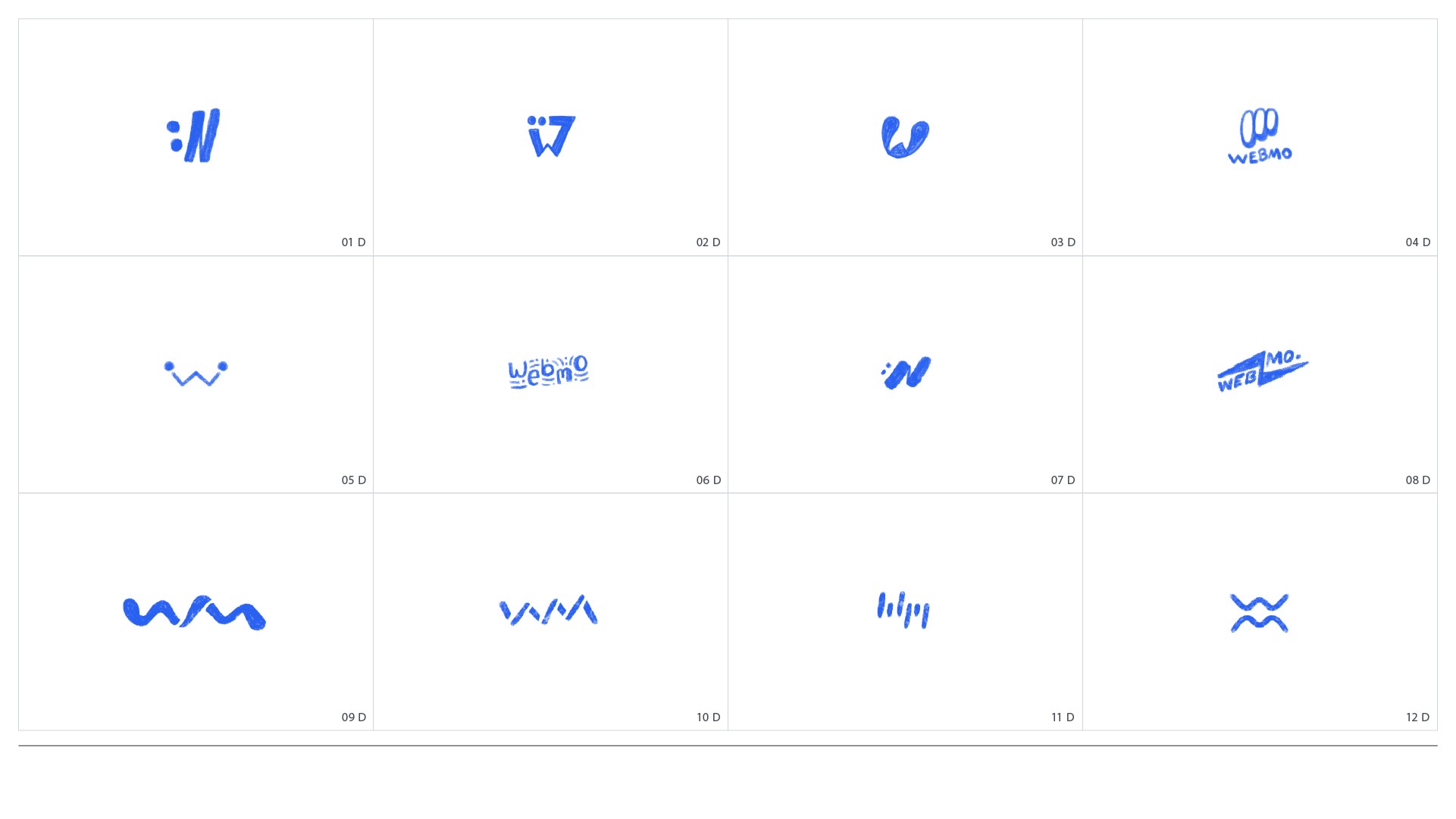
A grid of logo sketches for presentation to show Moin that were created in Procreate.

~ Moin was really drawn to the guy as a mascot style here as well.

~ Moin was really drawn to the guy as a mascot style here as well.

A grid of logo sketches for presentation to show Moin that were created in Procreate.

~ The final icon would be from this slide.

~ The final icon would be from this slide.

Two icons were selected to move forward with: a mascot-style icon and a colon/forward slash (://) icon forming a "W". The ://" icon conveyed a strong connection to the web, a core fundamental of a URL.

Two icons were selected to move forward with: a mascot-style icon and a colon/forward slash (://) icon forming a "W". The ://" icon conveyed a strong connection to the web, a core fundamental of a URL.

Refining the Logo

Refining the Logo

The mascot-style icon was deemed unsuitable for Webmo, as it is more fitting for a personal brand. The ://" icon was chosen, paired with a lowercase, soft, rounded typeface for the wordmark, making the logo friendly and approachable.

The mascot-style icon was deemed unsuitable for Webmo, as it is more fitting for a personal brand. The ://" icon was chosen, paired with a lowercase, soft, rounded typeface for the wordmark, making the logo friendly and approachable.

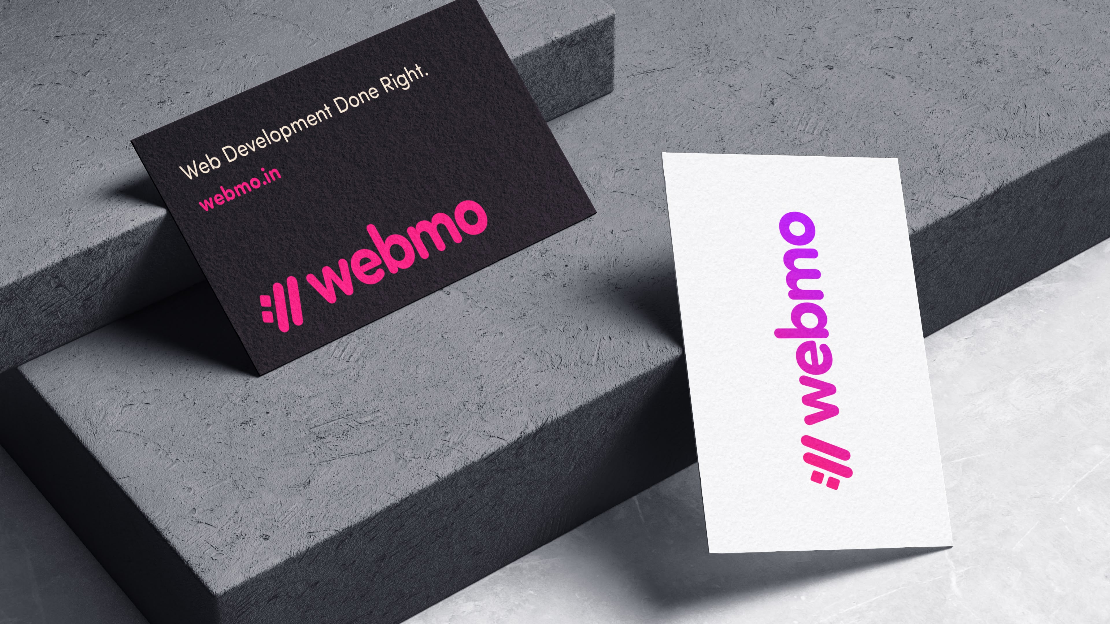
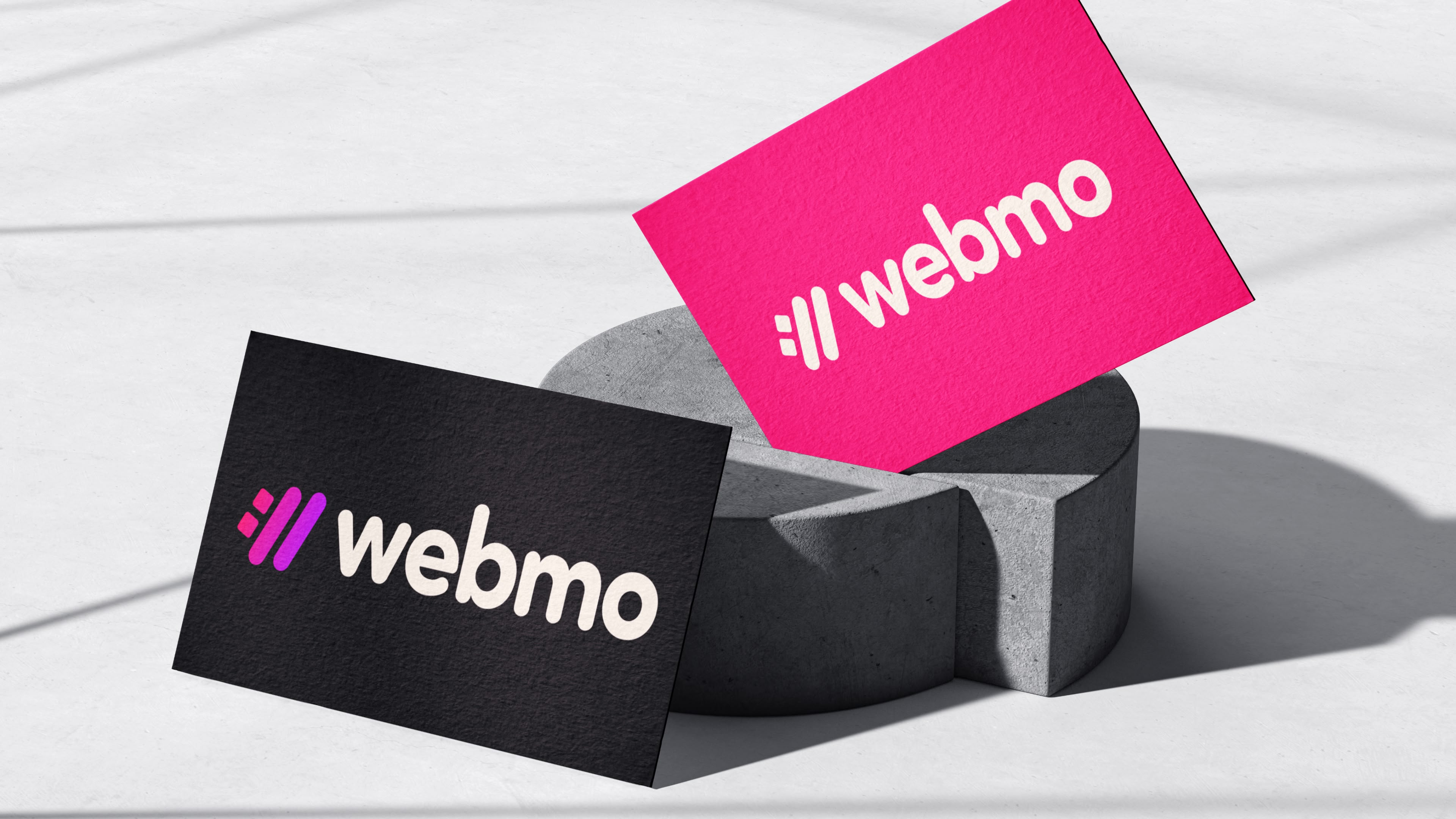
A mock-up of a black business card with a brand identity design, magenta logo at the bottom, big and bold text on the top, and another business card front design that has the Webmo logo in a gradient from pink to purple. The business cards are sitting on a marble modern architecture tabletop.

~ Exploring color in context.

~ Exploring color in context.

A business card design mockup with one front having black and the Webmo logo icon in a gradient of pink to purple and the Webmo logo type in a white color. Another business card mockup front with magenta color and the Webmo logo icon. logo type in white. One of the magenta cards is wedged in between a very interesting cement sculpture, while the black business card front is rested against the cement sculpture. They are sitting on a modern white marble tabletop with contrast lighting.

~ From the get, magenta was crushing.

~ From the get, magenta was crushing.

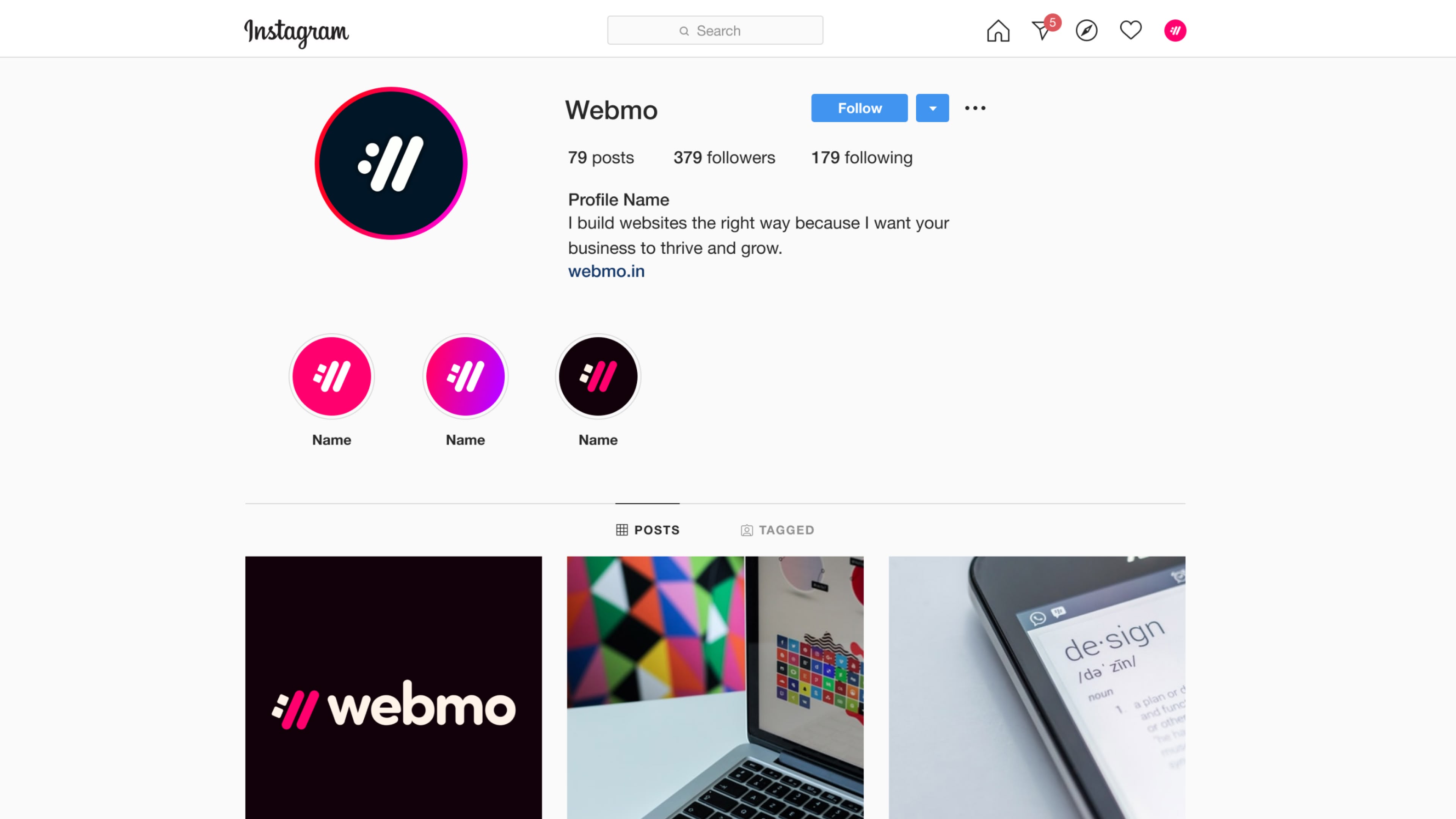
A mock-up of an Instagram account showing the WebMO logo in different various colors, focusing on magenta and purple.

~ Doing some simple social media exploration.

~ Doing some simple social media exploration.

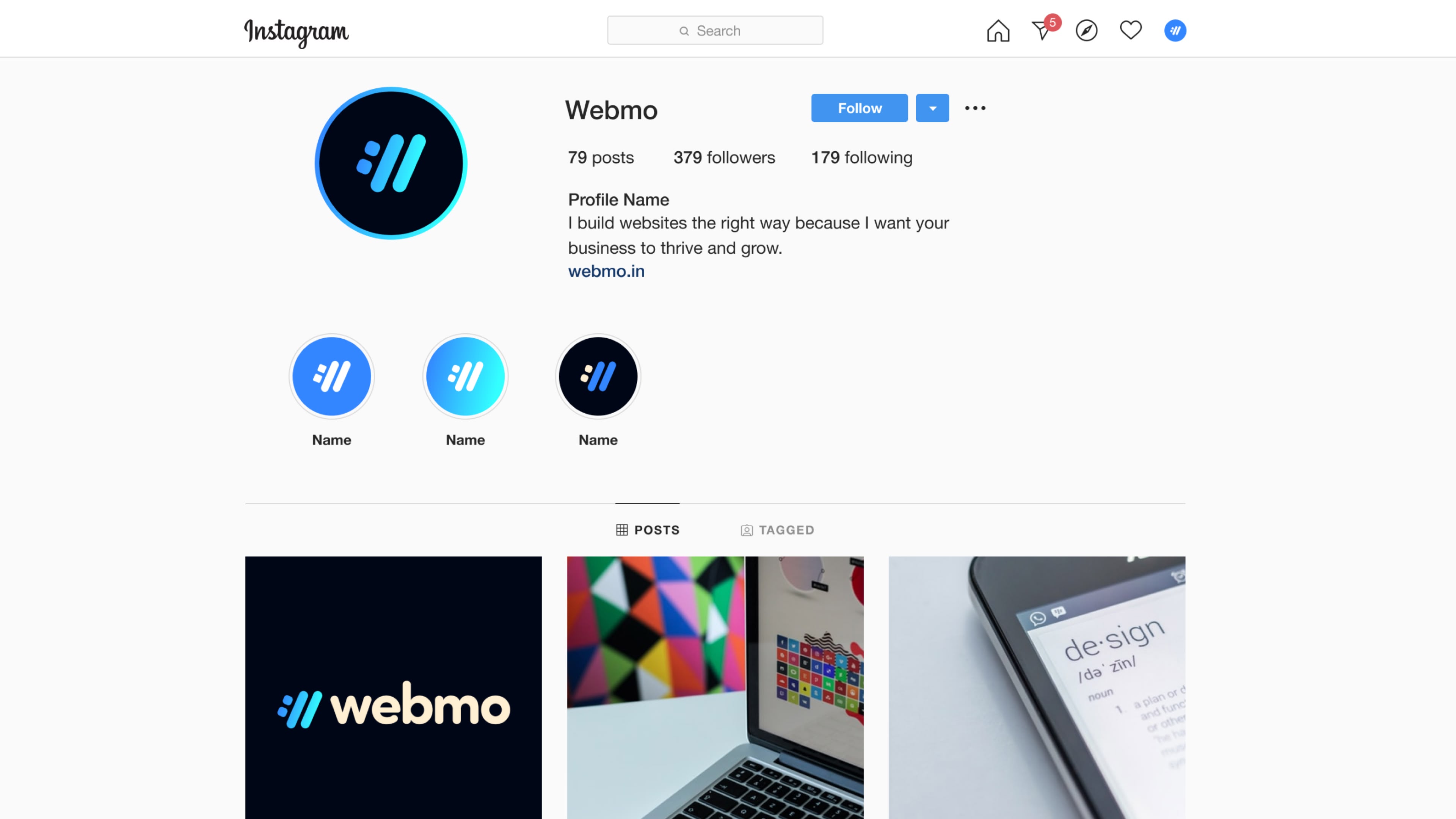
A mock-up of an Instagram account showing the WebMO logo in different various colors, focusing on blue to light blue.

~ Blue was almost, but magenta spoke more to the brand.

~ Blue was almost, but magenta spoke more to the brand.

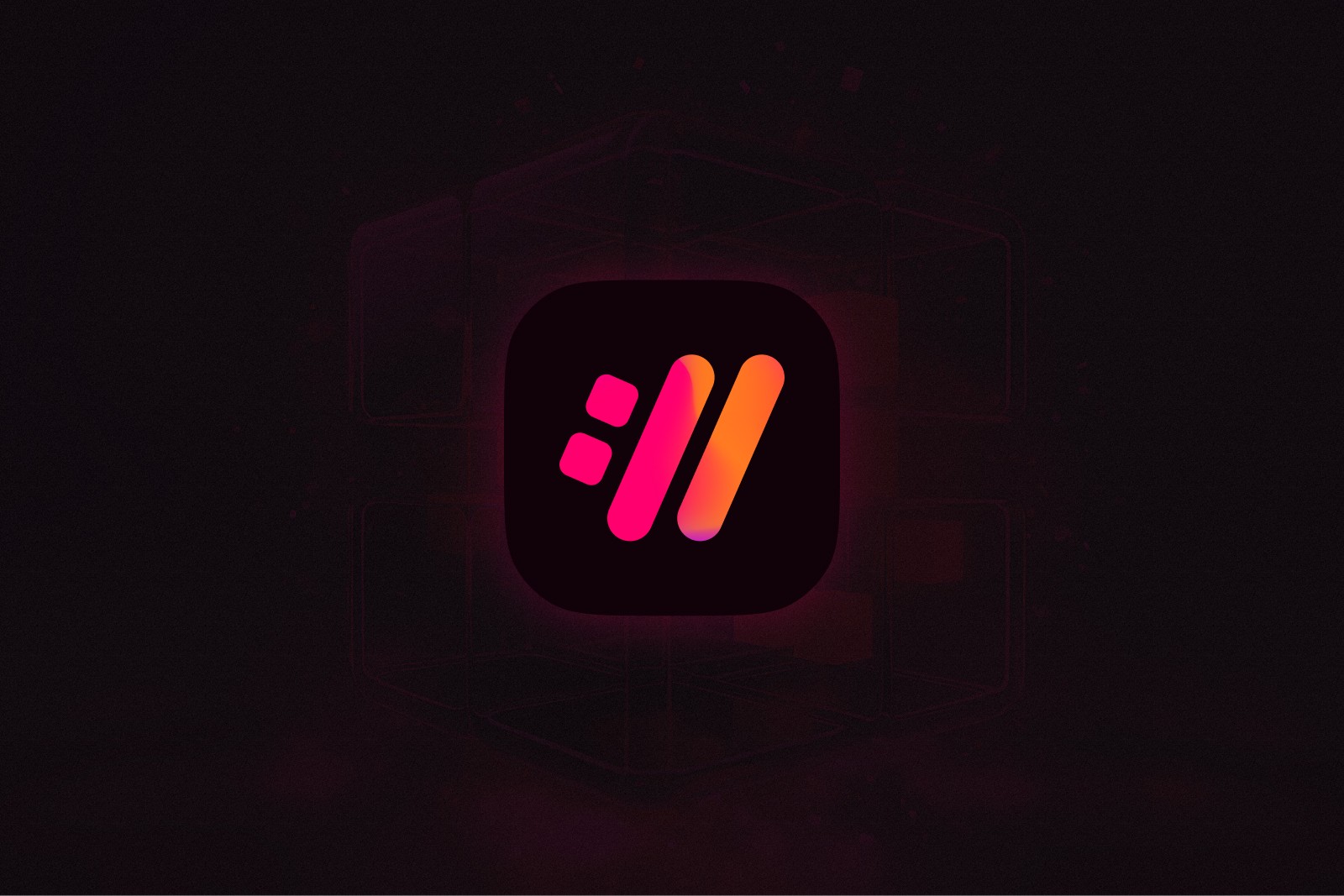
An app icon with the WebMO logo sitting in a dark icon area on top of a dark background. The app icon is glowing subtly, creating a modern and sleek feel.

~ Holi heavily inspired the final fun version of the logo icon.

~ Holi heavily inspired the final fun version of the logo icon.

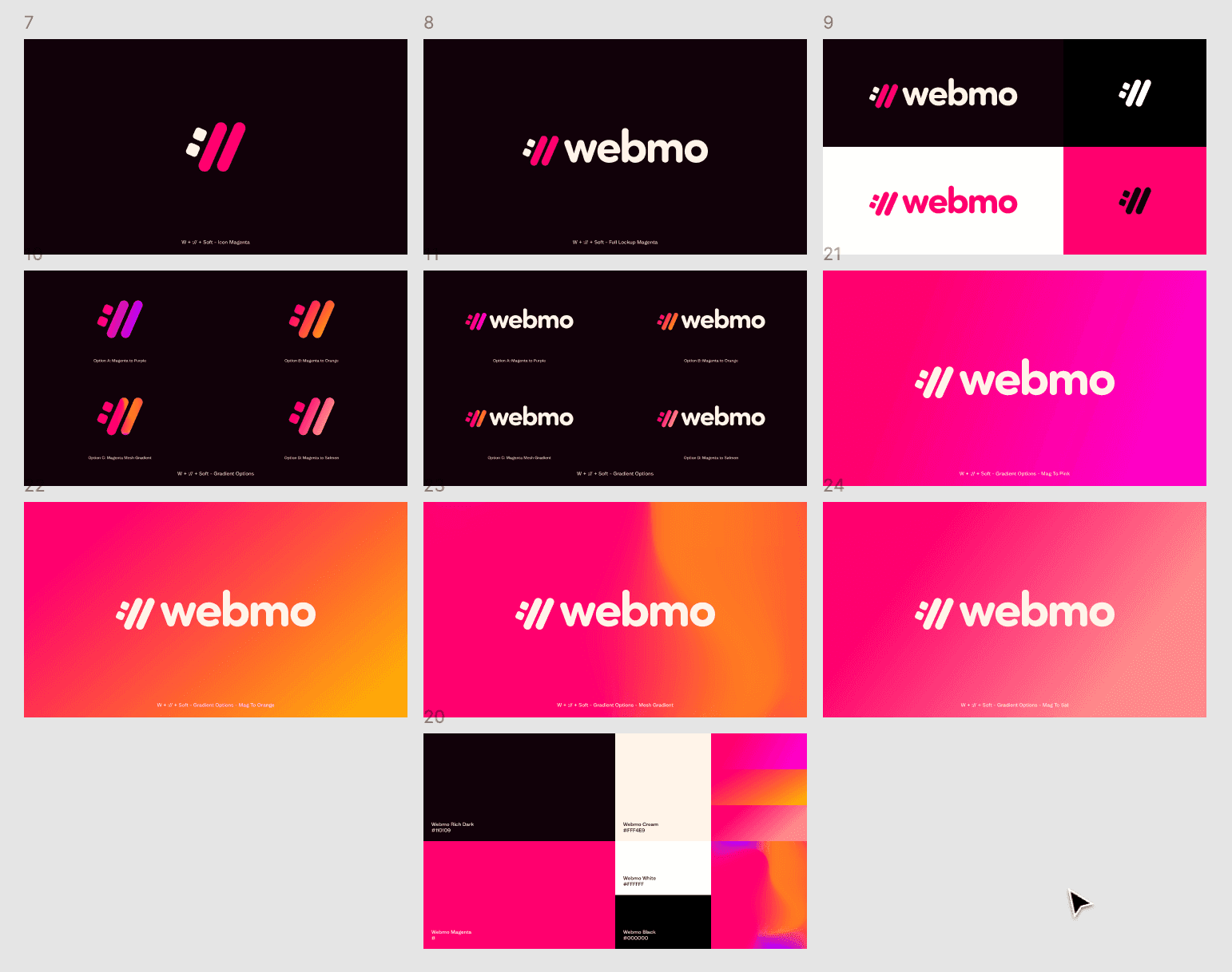
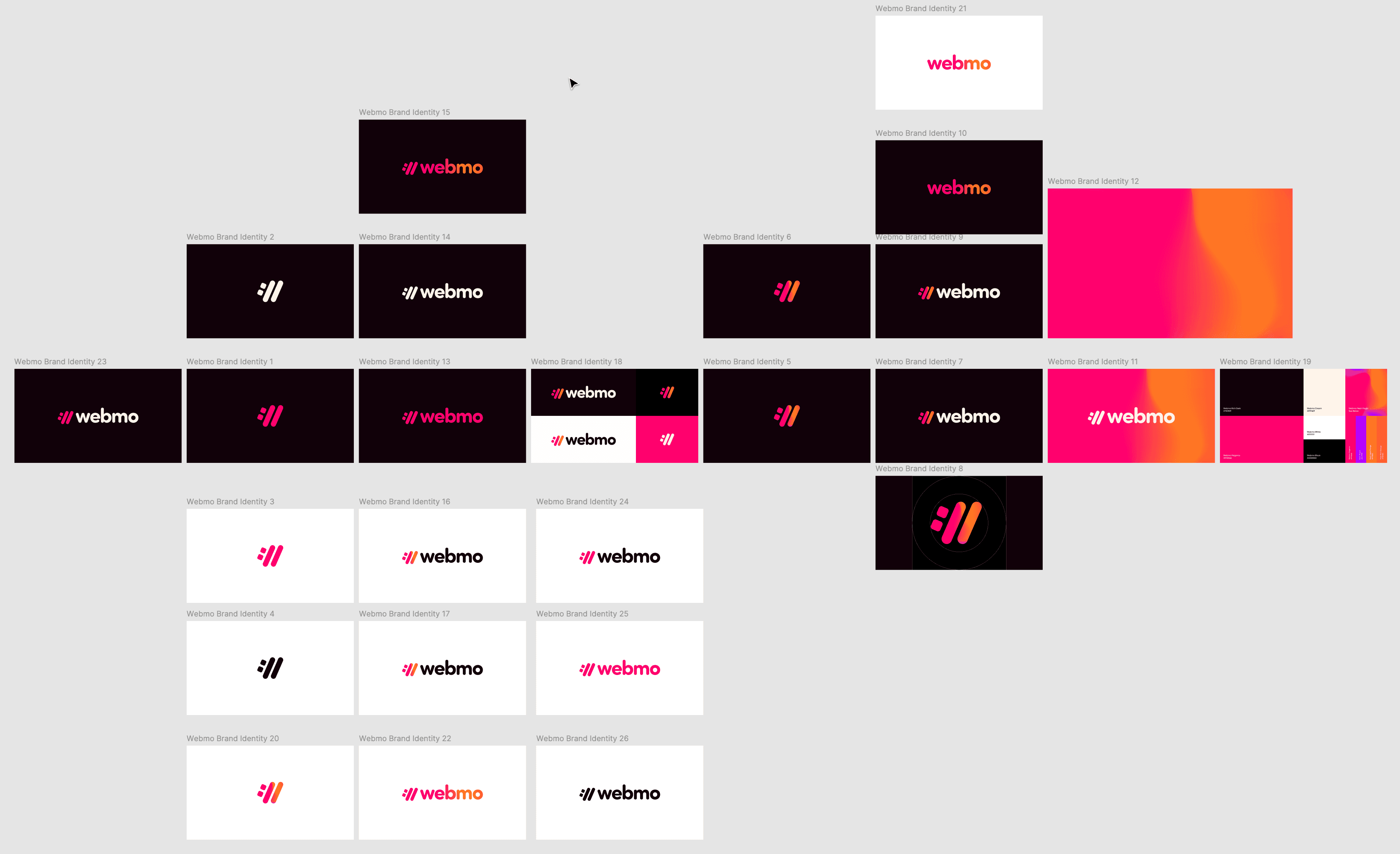
A screenshot from Adobe Illustrator showing the different iterations of the Webmo logo, a color palette, the different color variations, and different logo mark variations.

~ Artboards in Illustrator, showing the final exploration that led to cemented styles.

~ Artboards in Illustrator, showing the final exploration that led to cemented styles.

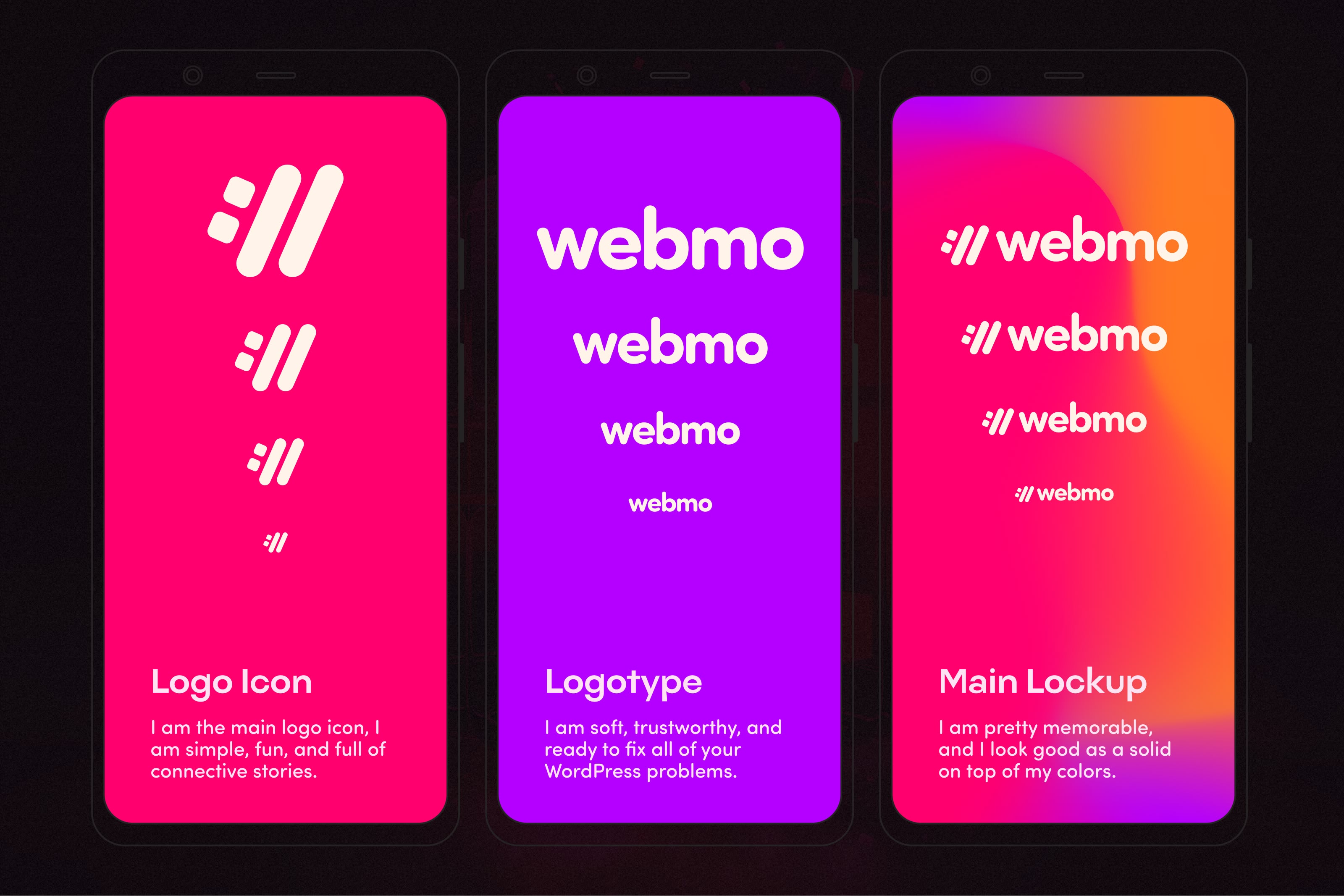
A simple and modern mockup that is a vector mockup of three mobile phones that are Android. It contains one magenta phone screen that shows the logo icon in different sizes, and another panel that is purple on the Android.   Vector mockup that shows the logo type in different sizes, and then another panel with the mesh gradient showing the full logo in different sizes

~ Cemeted main accent colors and logo elements.

~ Cemeted main accent colors and logo elements.

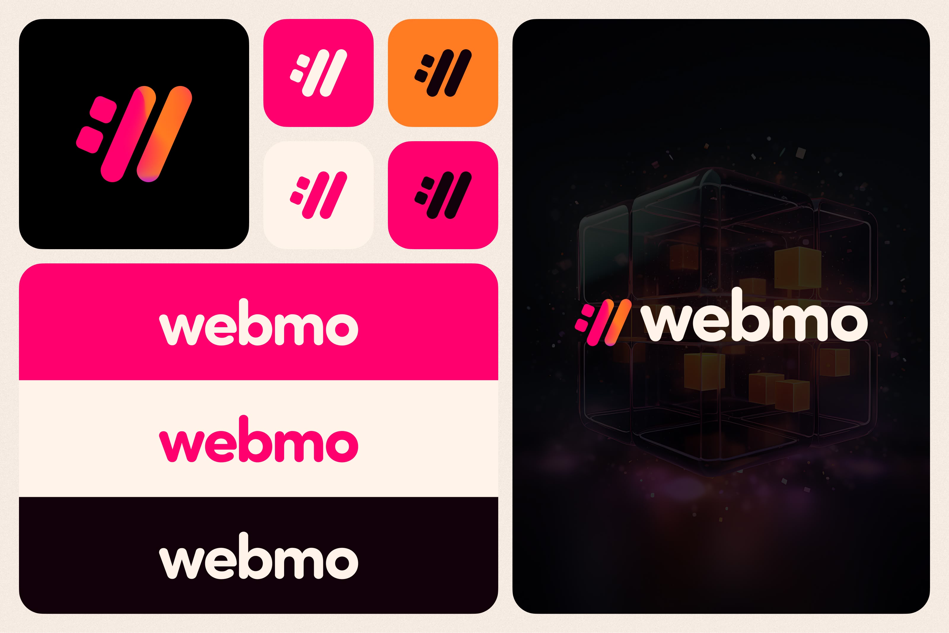
A bento design of the Webmo logo showing different boxes containing different color variations of the logo icon. One box showing 3 color variations of the Webmo logo type and one big box showing an AI-generated image in the background and the Webmo full logo lockup with the Webmo icon being the wholly inspired color palette.

The introduction of the AI imagery library and treatment.

The introduction of the AI imagery library and treatment.

Significance of the :// Icon

Significance of the :// Icon

The :// icon speaks to Webmo's passion for empowering businesses online through their WordPress expertise. It creates a subconscious link between the logo icon and the user's everyday web experience.

The :// icon speaks to Webmo's passion for empowering businesses online through their WordPress expertise. It creates a subconscious link between the logo icon and the user's everyday web experience.

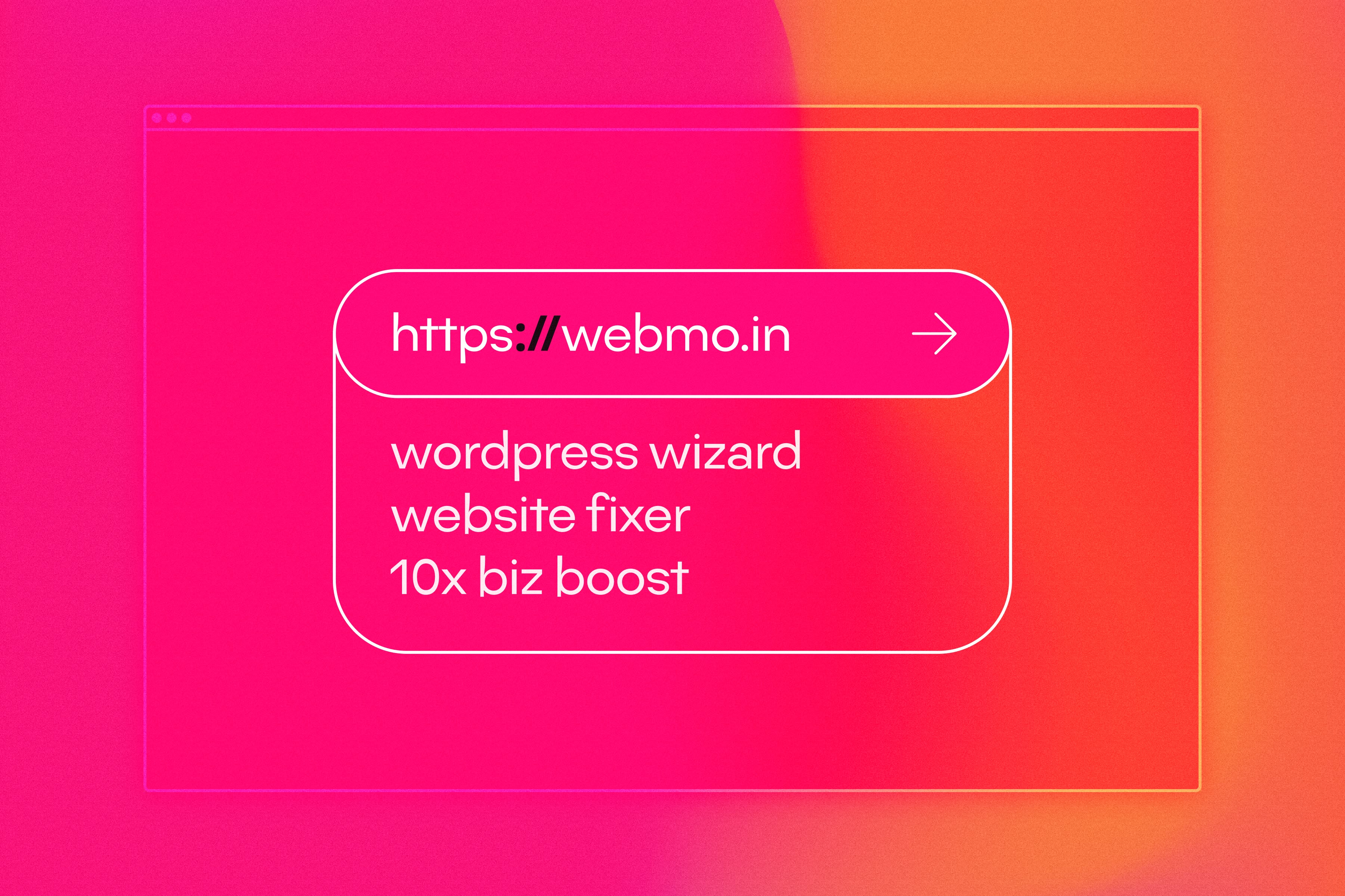
An interesting design showing the significance of the WebMO logo icon, its meaning, and its relationship to the web. The correlation to the very fundamentals of the web is also highlighted.

~ The logo icon is the very base of the web.

~ The logo icon is the very base of the web.

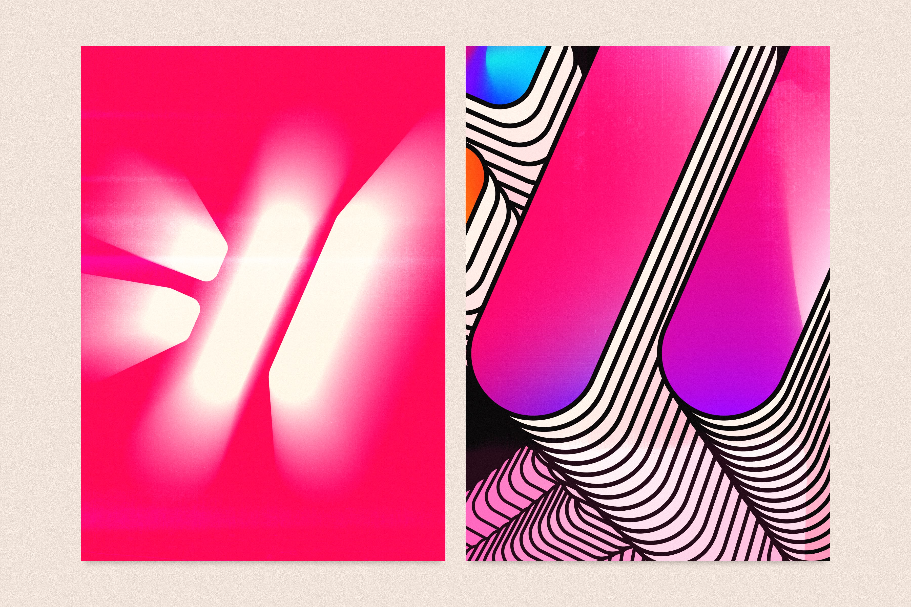
Two poster designs that use the WebMO logo icon to create art and abstract representations that are colorful and have a slight texture to them.

~ The logo icon led to many very cool abstract enticements.

~ The logo icon led to many very cool abstract enticements.

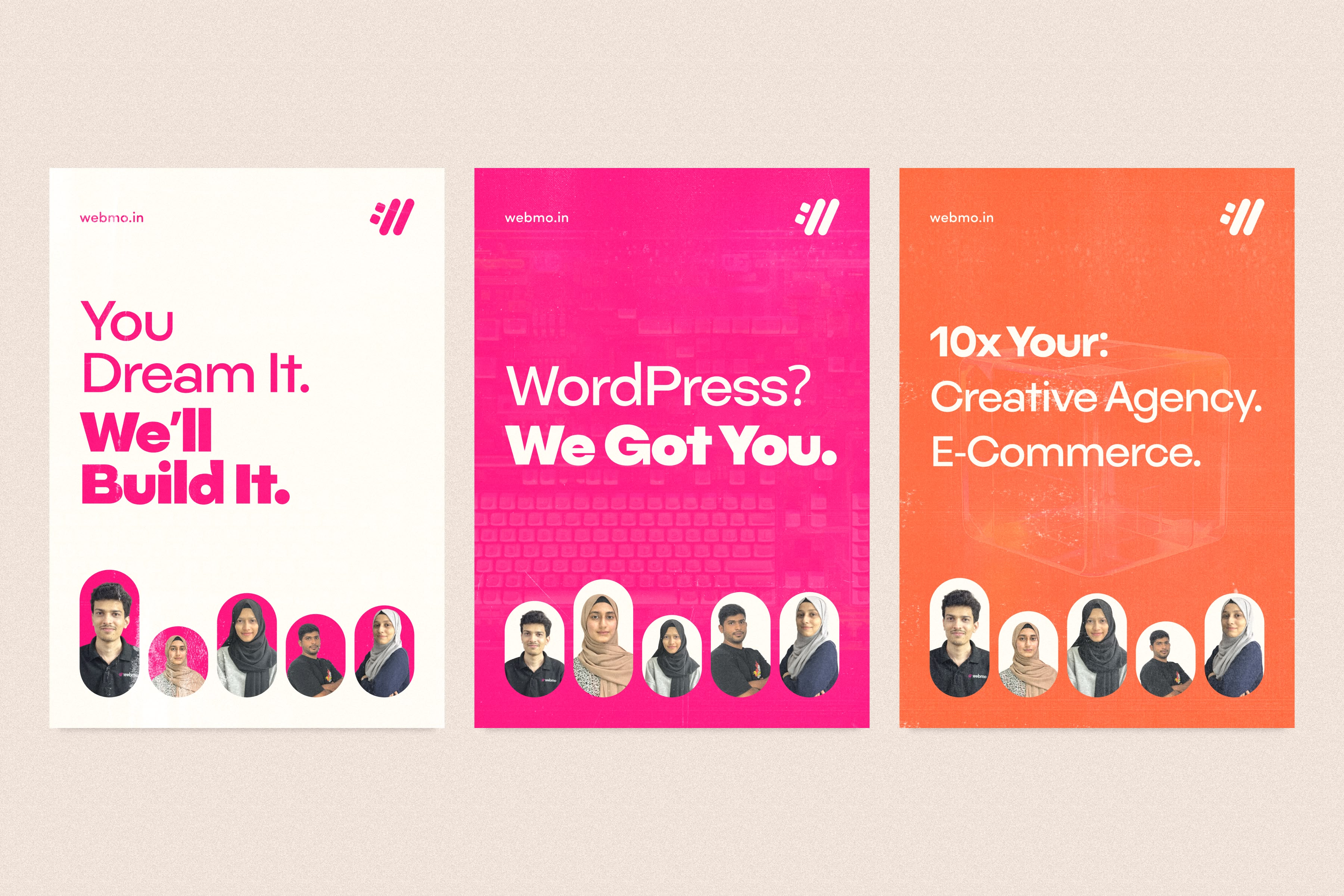
3 posters that are to be used as marketing collateral for the Webmo brand. Each poster is exhibiting copy: - "You dream it and we'll build it." - "WordPress, we got you." - 10x your creative agency and e-commerce. Each poster contains cutouts of the Webmo team - 2 Indian males that are young and 3 Indian females that are young as well.

~ Some more practical marketing collateral.

~ Some more practical marketing collateral.

Color Scheme + Logo Variations

Color Scheme + Logo Variations

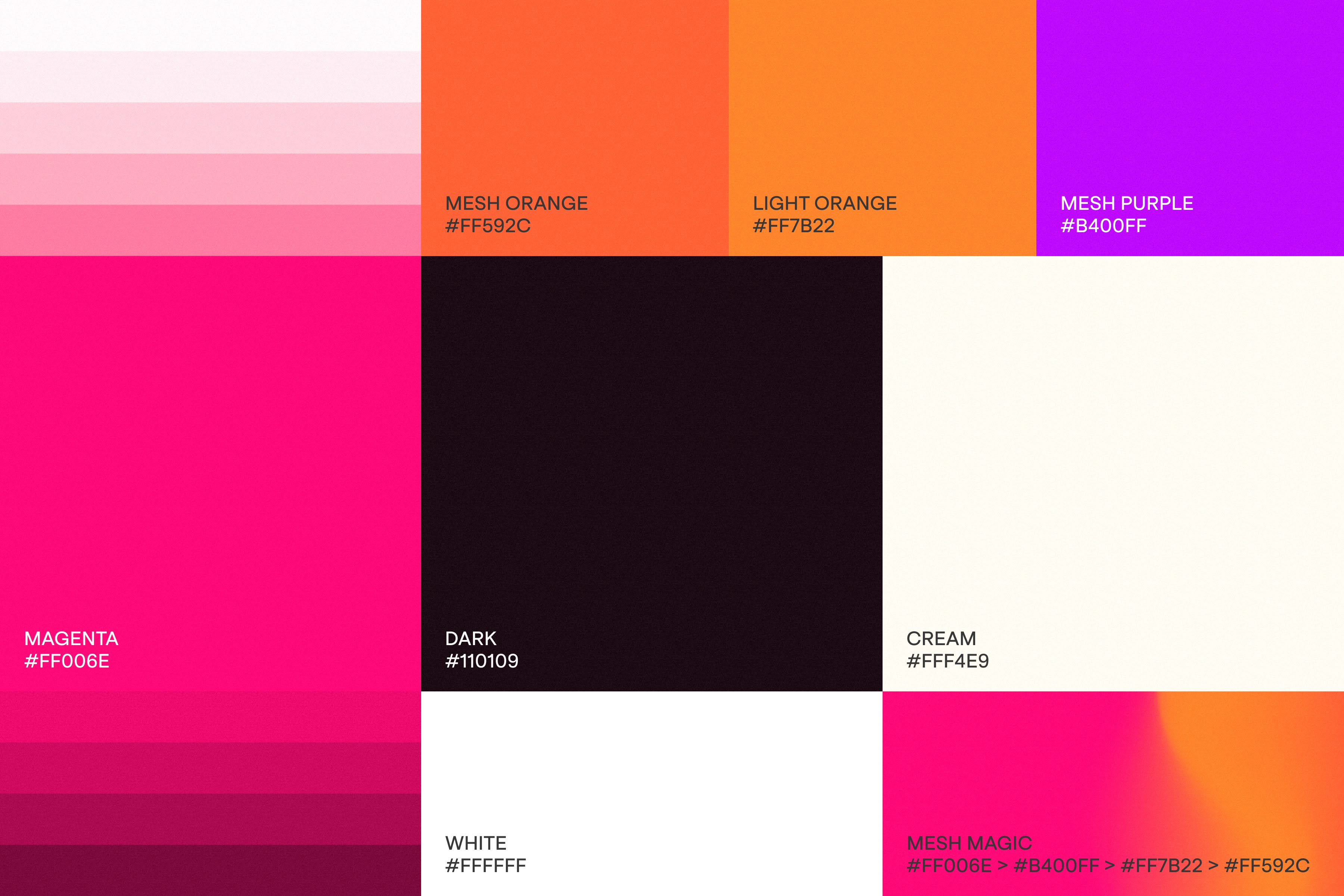
Inspired by Holi, an Indian festival known for its vibrant colors, the primary colors included purples and magentas. Three logo variations were developed:


  • A mesh gradient with a splash of Holi-inspired chalk (primary)

  • A negative version in cream or white on black (tertiary)

  • A solid magenta version (secondary)

This is a mood board style of the color palette of Webmo, showing the different color chips with the name of the color and the hex code for the color.

~ The basic color palette.

~ The basic color palette.

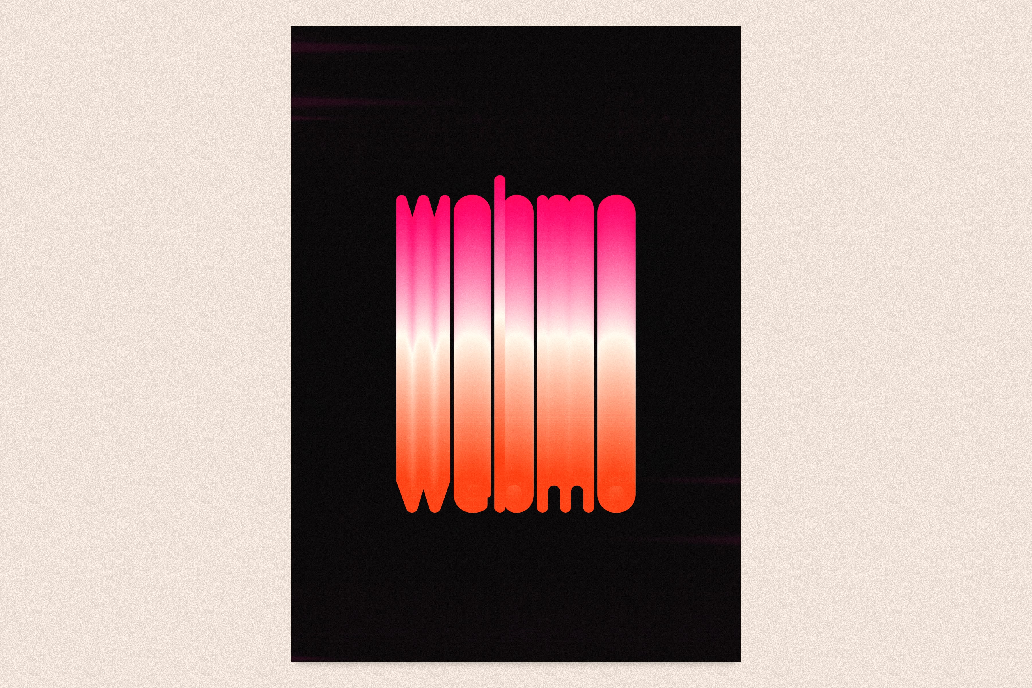
A fun, abstract poster for Webmo that is very interesting. It shows off the color palette and the logo type. The poster is a dark background and the Webmo logo type goes from the top to the bottom with a color blend from magenta to orange.

~ The Magenta to Orange, inspired by Holi dust is so nice.

~ The Magenta to Orange, inspired by Holi dust is so nice.

A screenshot of the Adobe Illustrator artboards of the finalized WebMO logos. Everything from logo variations to logo icon variations to logo type variations, color variations, and social media variations.

~ The full layout of the logo variations.

~ The full layout of the logo variations.

Typography Selection

Typography Selection

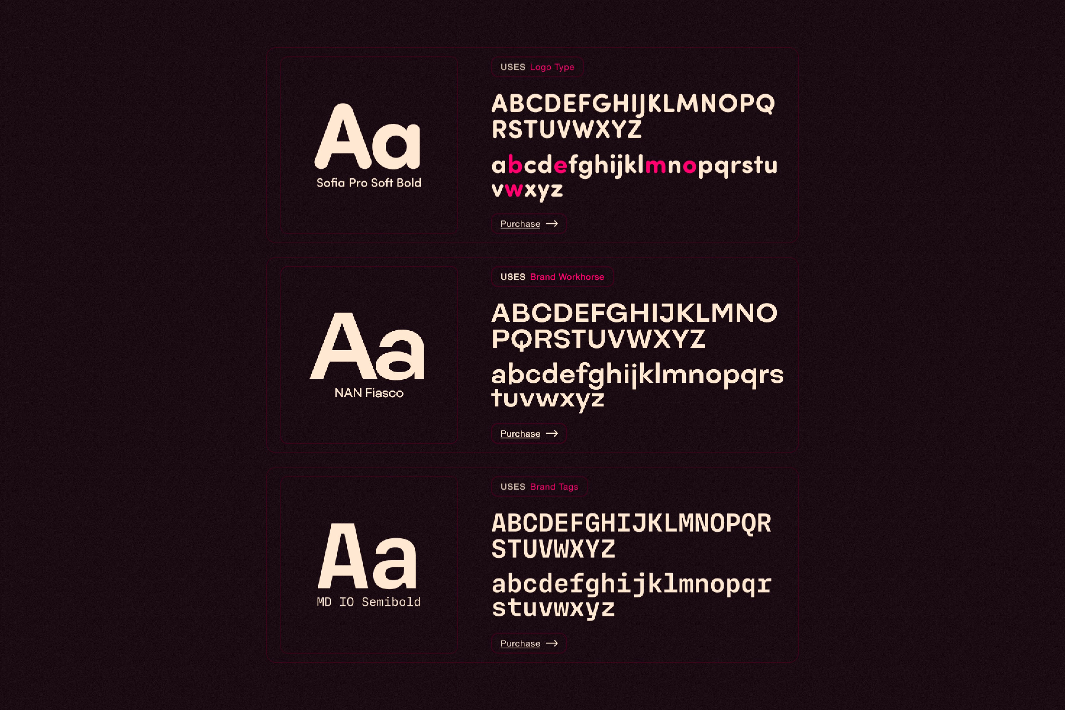
The chosen typeface needed to have the right amount of boldness and a geometric feel, connecting well with technology. It also required enough character to differentiate it from others.

The chosen typeface needed to have the right amount of boldness and a geometric feel, connecting well with technology. It also required enough character to differentiate it from others.

A design that shows off the typography selection for the Webmo brand: - Sofia Pro Soft Bold (used for the Webmo logo type) - NAN Fiasco (used as the brand workhorse typography) - MD IO Semi Bold  that is used for tags and labels.

~ From logotype, to Headline, to that extra bloop of magic.

~ From logotype, to Headline, to that extra bloop of magic.

Social Media Template

Social Media Template

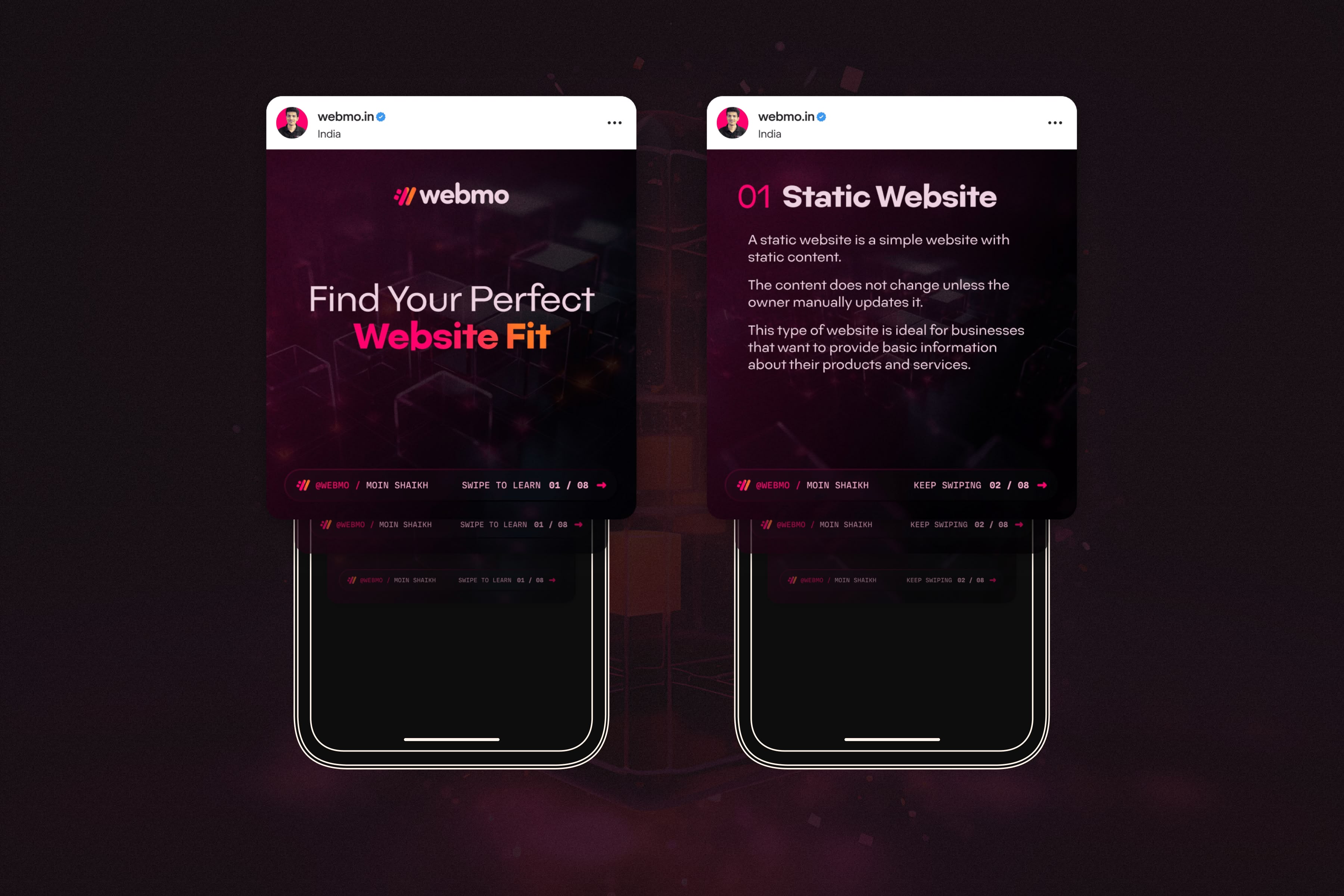
An Instagram carousel template was designed based on Webmo's past content, incorporating the new brand elements. Different versions were created to accommodate various content types, with evergreen elements like navigation and calls-to-action.

An Instagram carousel template was designed based on Webmo's past content, incorporating the new brand elements. Different versions were created to accommodate various content types, with evergreen elements like navigation and calls-to-action.

A mockup representation of the social media posting template for Instagram, showing the first slide of the template and then the inner content slides sitting on a vector mockup of an iPhone. There are two mockups with the two slide variations sitting on top of a abstract modern dark background.

~ The social media template to help Moin connect and grow.

~ The social media template to help Moin connect and grow.

DELIVER

DELIVER

Website UI/UX to final assets.

Website UI/UX to final assets.

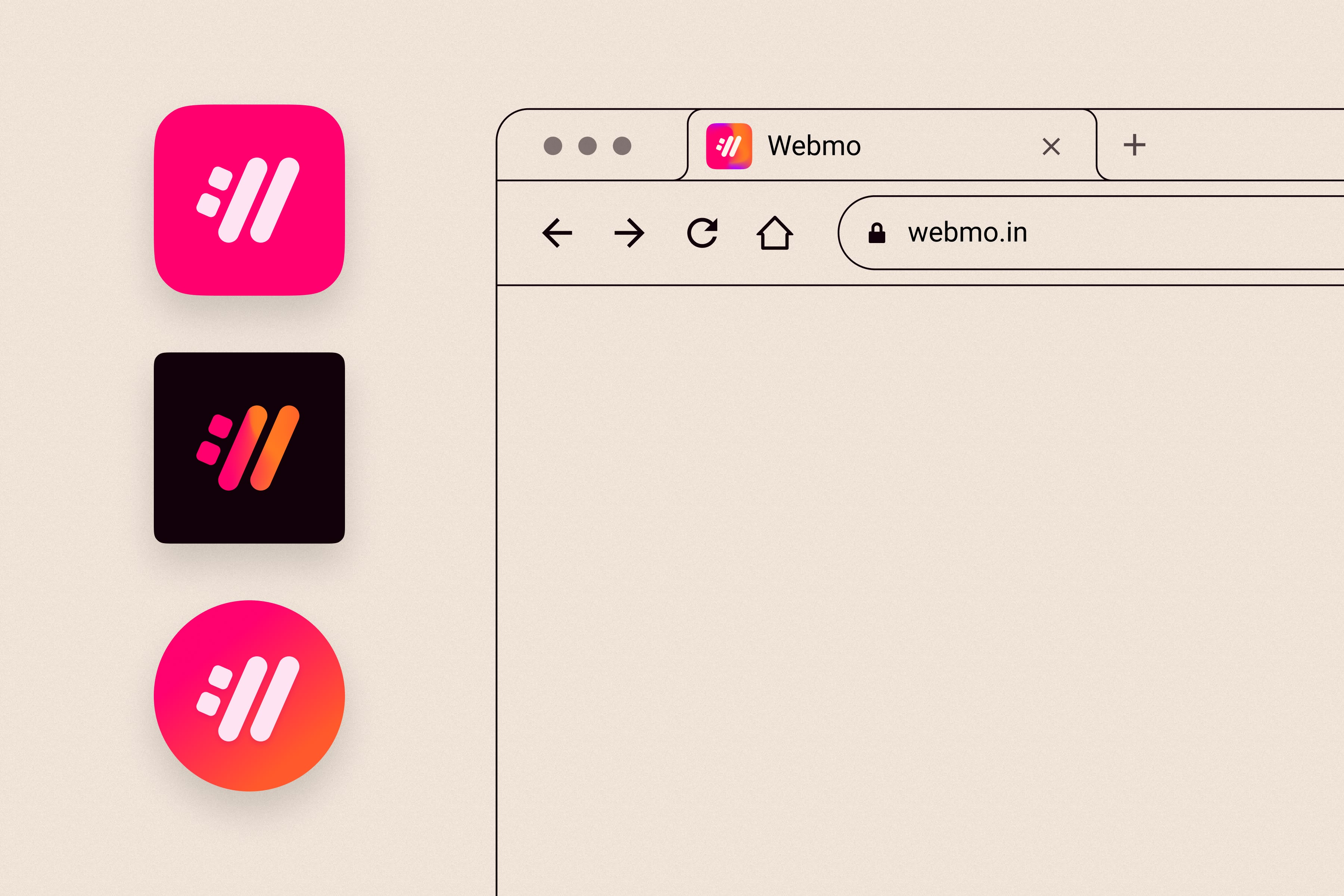
After finalizing the logo, various versions were exported for digital and print use. A social media avatar size was also developed.

After finalizing the logo, various versions were exported for digital and print use. A social media avatar size was also developed.

A design mockup that is simple and vector with line art, showing three variations with three color schemes of the WebMO logo icon next to a vector representation of a browser (like Google Chrome) showing the favicon in the browser tab to show off the versatility of the WebMO logo icon.

~ The scalability of the logo is super effective.

~ The scalability of the logo is super effective.

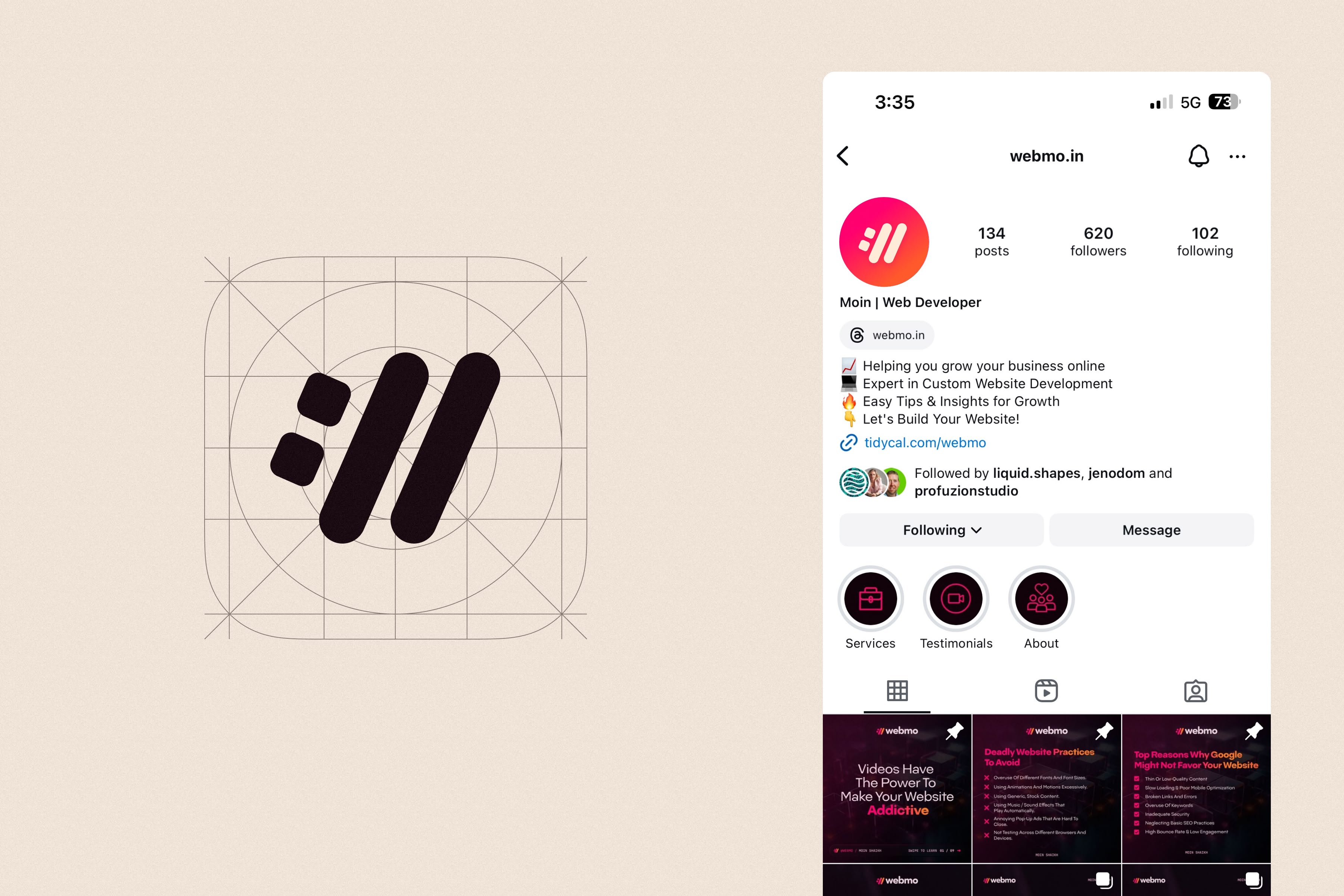
A simple technical mockup of the WebMO logo icon in a gridded layout that is square, showing the different dimensions and where the logo icon sits. Next to that is a mockup of an Instagram account on mobile showing the logo icon in the account avatar.

~ Setting those guardrails for a professional look online.

~ Setting those guardrails for a professional look online.

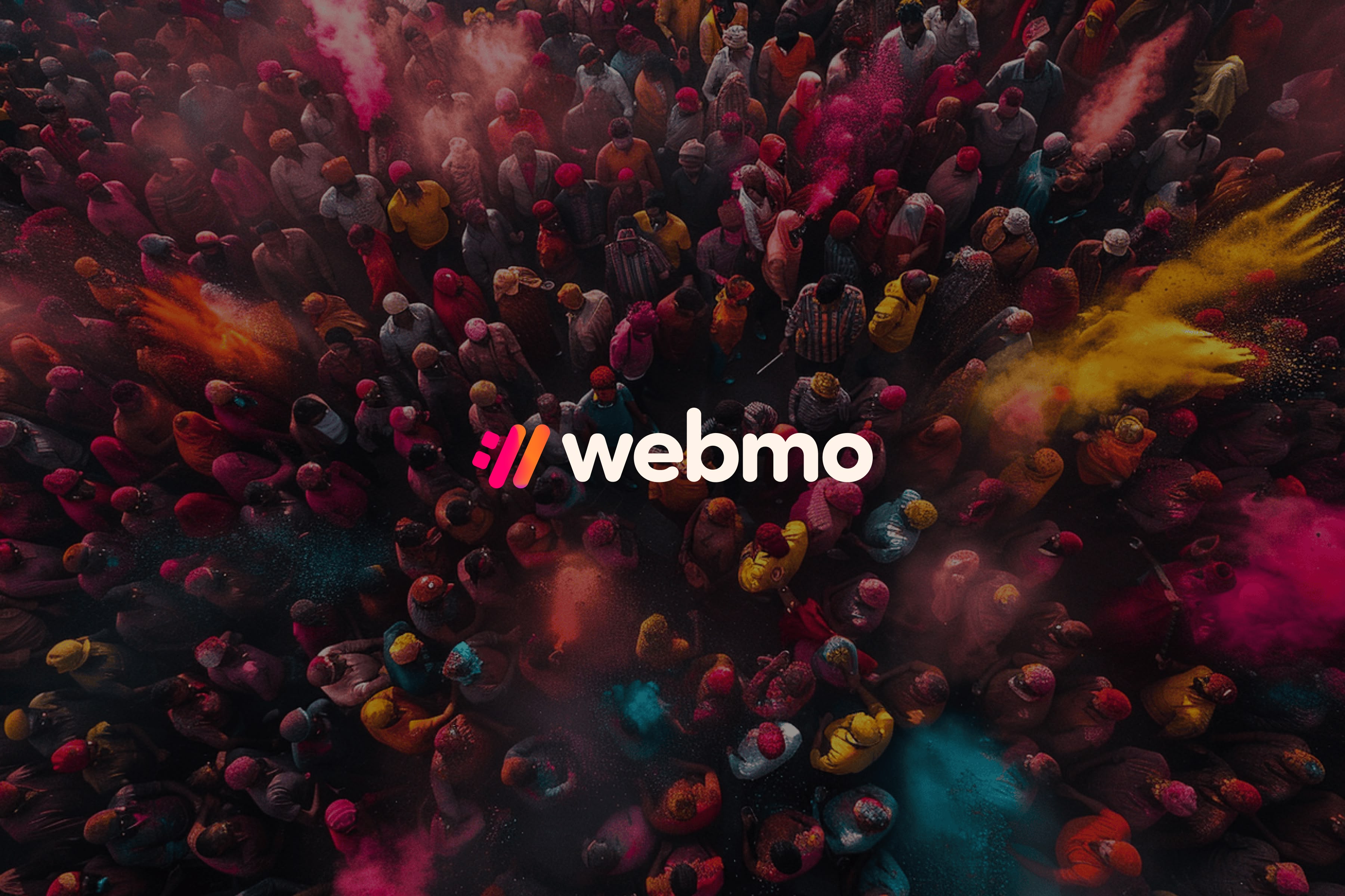
An overhead drone photography of a bunch of people enjoying and celebrating the Indian holiday of Holi.   Dark background overlay and the full WebMO logo lockup and logo icon that is colorful and the Holi-inspired mesh gradient for the logo icon.

~ This really conveys the marriage of Moins culture and a digital engineer.

~ This really conveys the marriage of Moins culture and a digital engineer.

Website UI/UX

Website UI/UX

A one-page website was designed for Moin to help him get launched and give him an amazing base to start with. The website would have high-level copy that I developed, and showcasing a simple portfolio.


I really helped push Moin to get video testimonials and to put him and his team's face front and center, so that the viewer of the website would instantly connect with Moin on a deeper level. The website design provided a lot of visual branding elements that Moin and his team can use in other collateral aspects, and also provides a solid base for him to grow and expand.

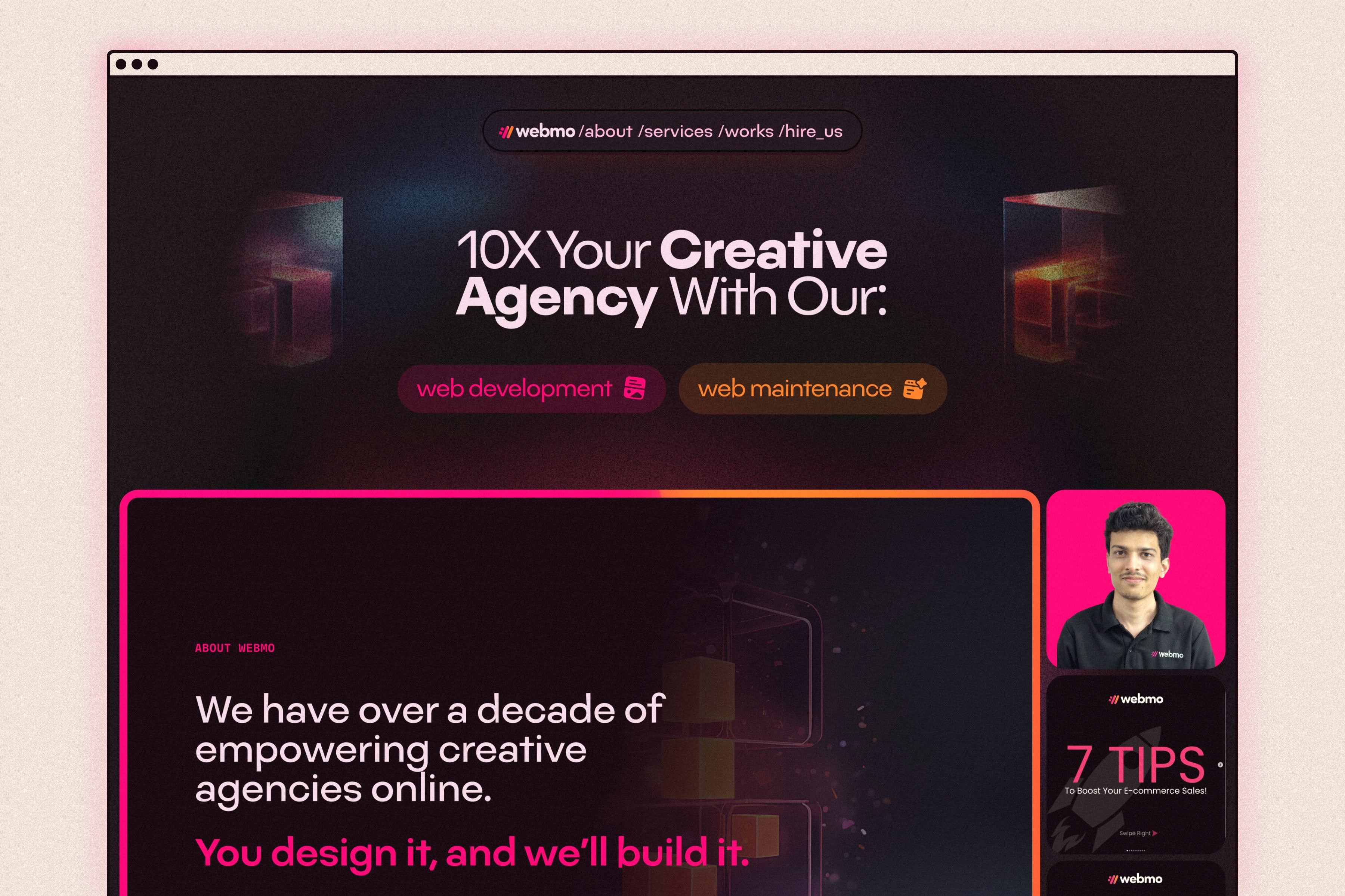
A mockup of the homepage UI/UX design for the Webmo homepage. A colorful homepage design that is modern, sleek, and professional with a hint of personality and showing Moen's face front and center on the hero section.

~ Hero design.

~ Hero design.

~ Yummy interactions

~ Yummy interactions

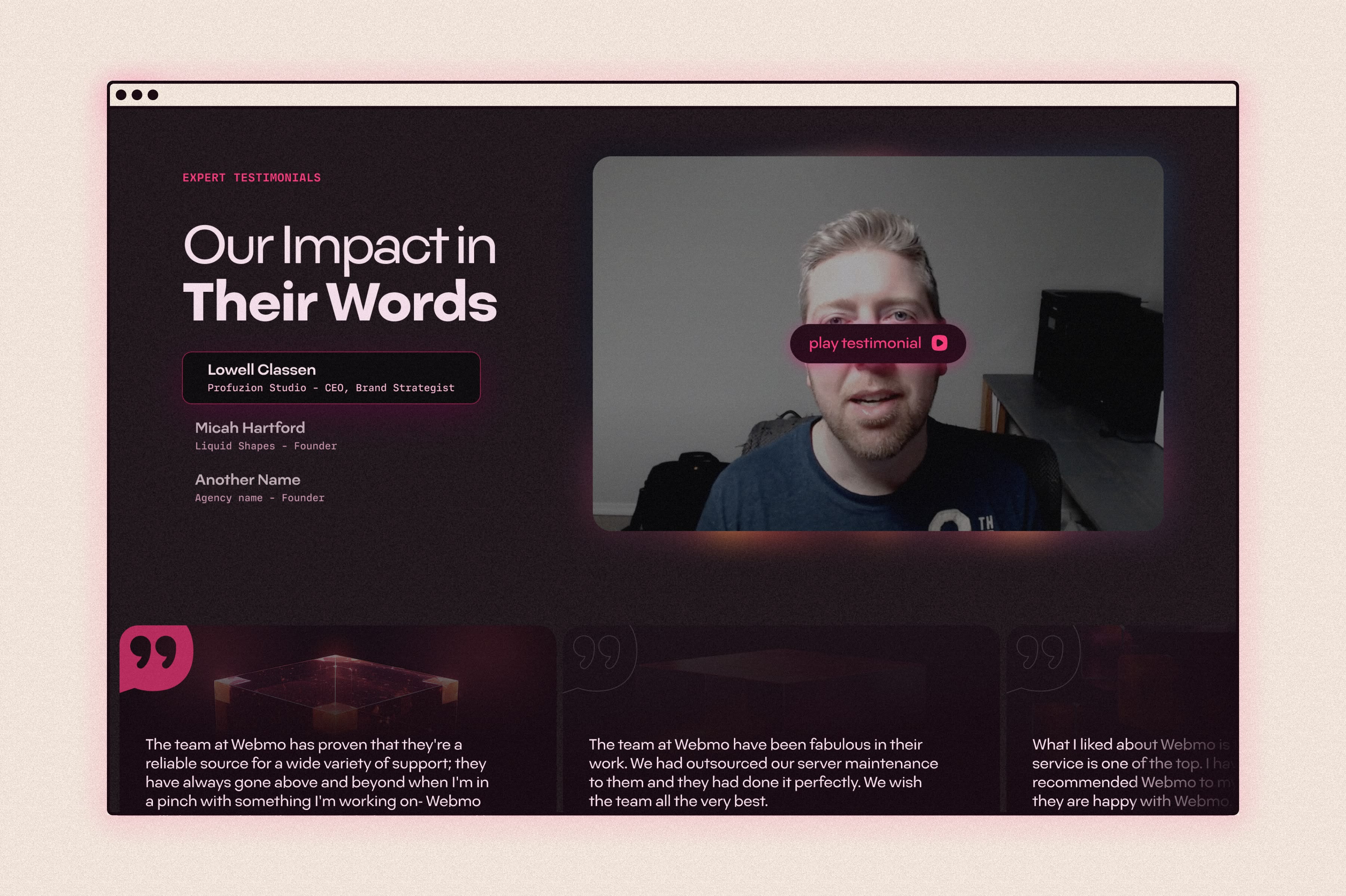
A website mockup of the testimonials section of the Webmo website that shows a video testimonial ready to be played along with text-only testimonials in a slider carousel below the video. The video section in the testimonials has three videos that can be played and are selectable via a tab.

~ Testimonials section is a mix of video and written.

~ Testimonials section is a mix of video and written.

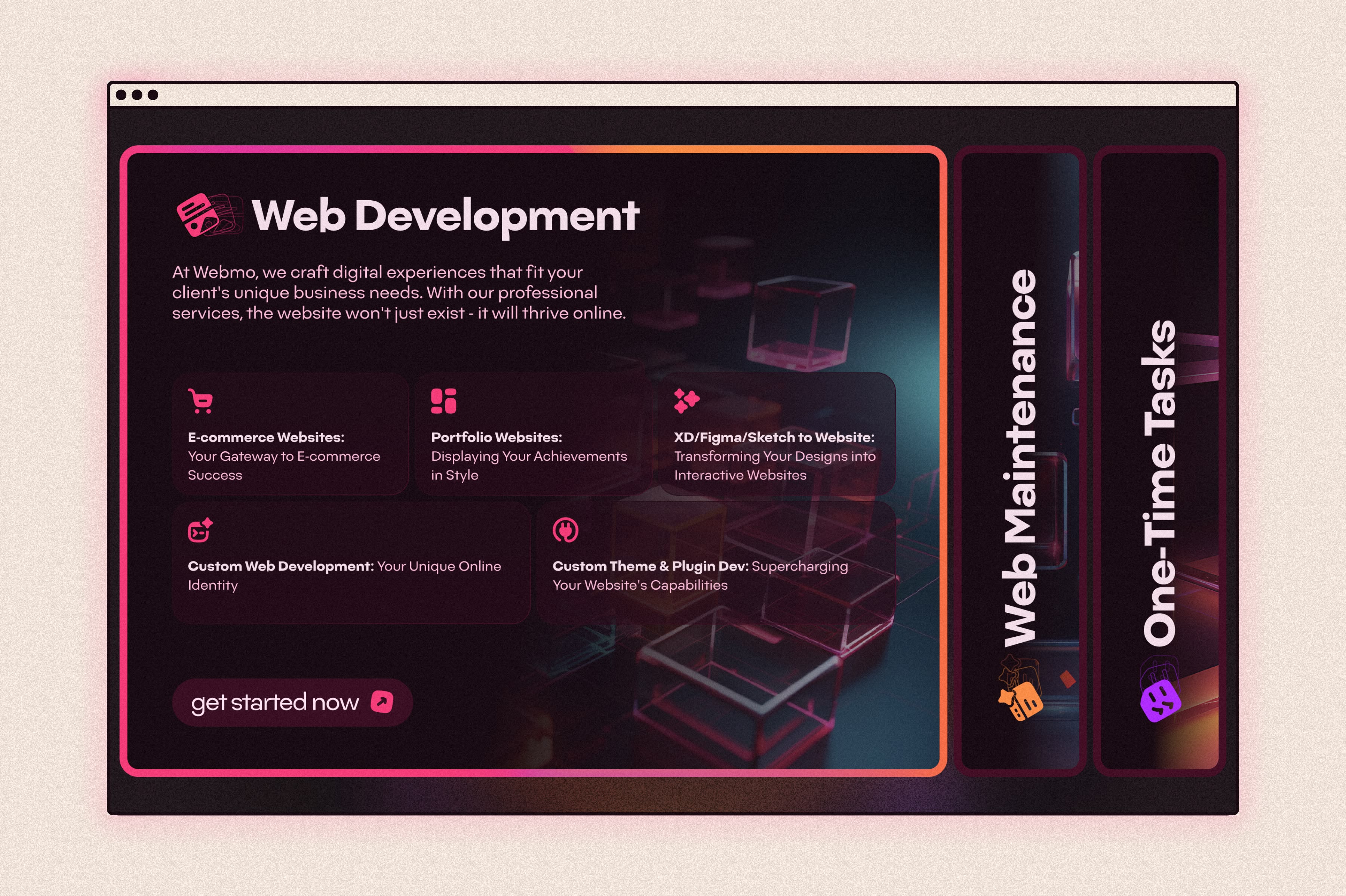
A website mockup of the services section for the Webmo website that is a very modern and colorful design that is also unique. It is a tab system with one tab open, showing the different services for that particular category, and two other tabs vertically closed, ready for a user to click and activate.

~ The impact of fun UX pays dividends.

~ The impact of fun UX pays dividends.

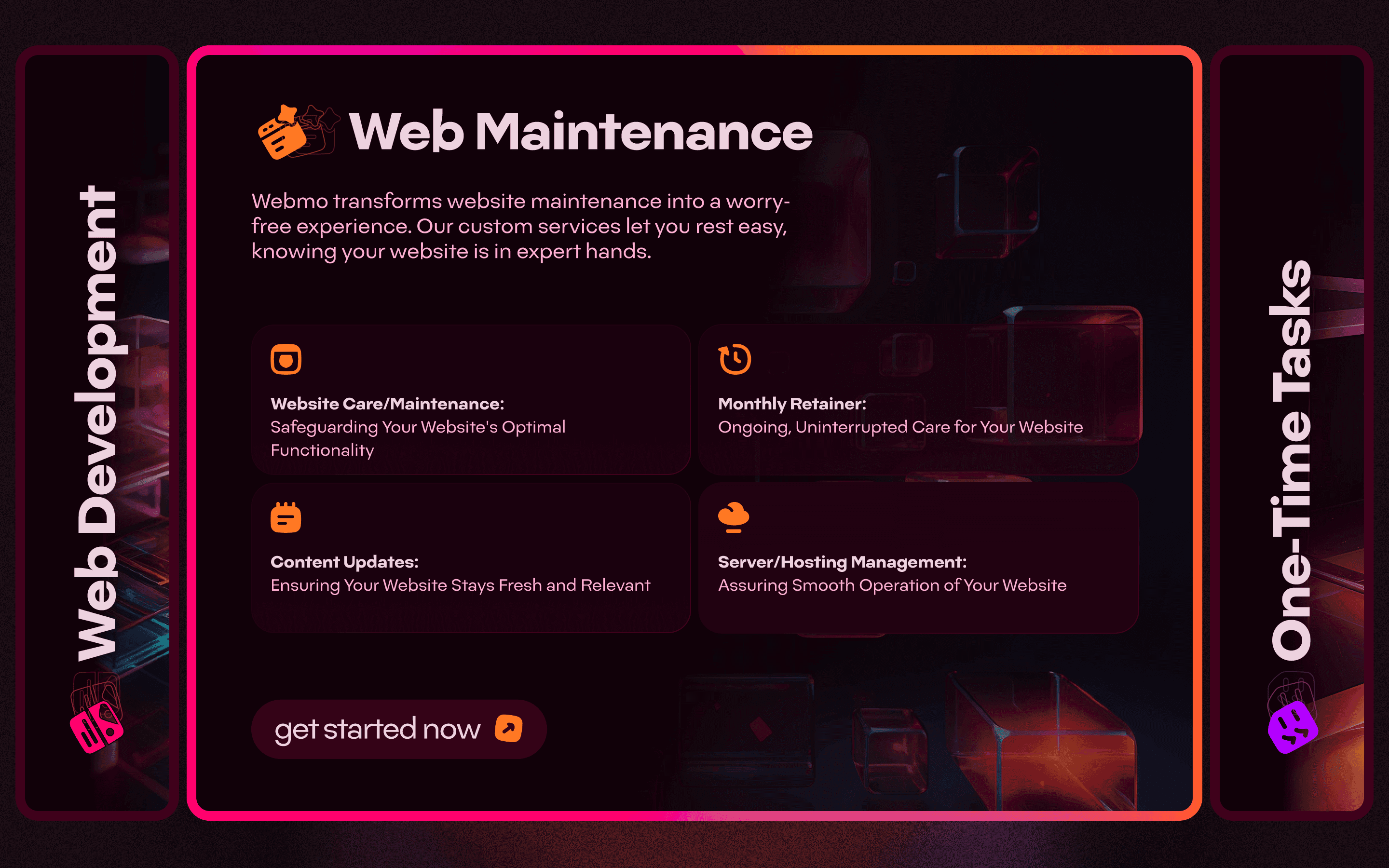
A website mockup of the services section for the Webmo website that is a very modern and colorful design that is also unique. It is a tab system with one tab open, showing the different services for that particular category, and two other tabs vertically closed, ready for a user to click and activate.

~ Slide two

~ Slide two

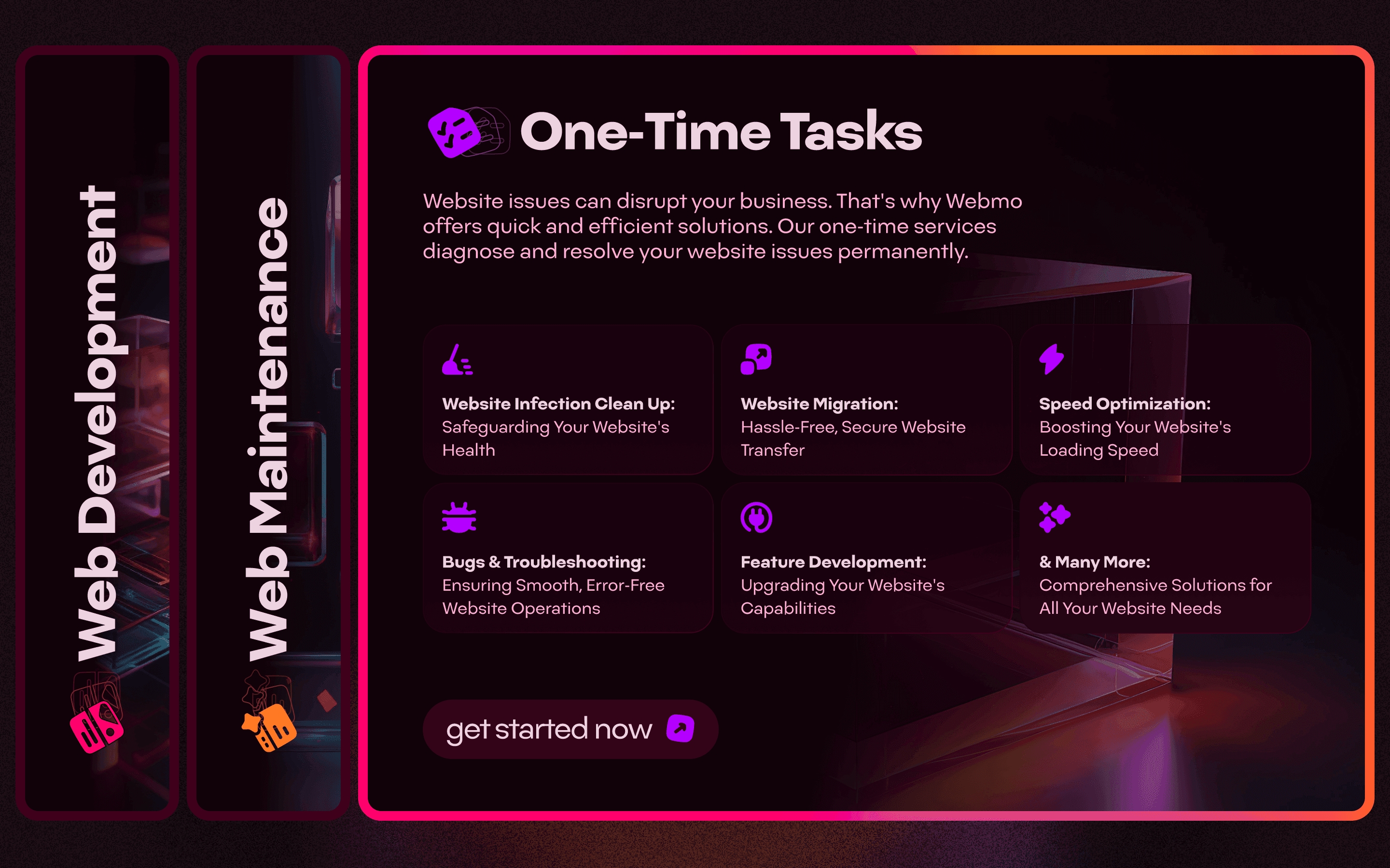
A website mockup of the services section for the Webmo website that is a very modern and colorful design that is also unique. It is a tab system with one tab open, showing the different services for that particular category, and two other tabs vertically closed, ready for a user to click and activate.

~ Slide three

~ Slide three

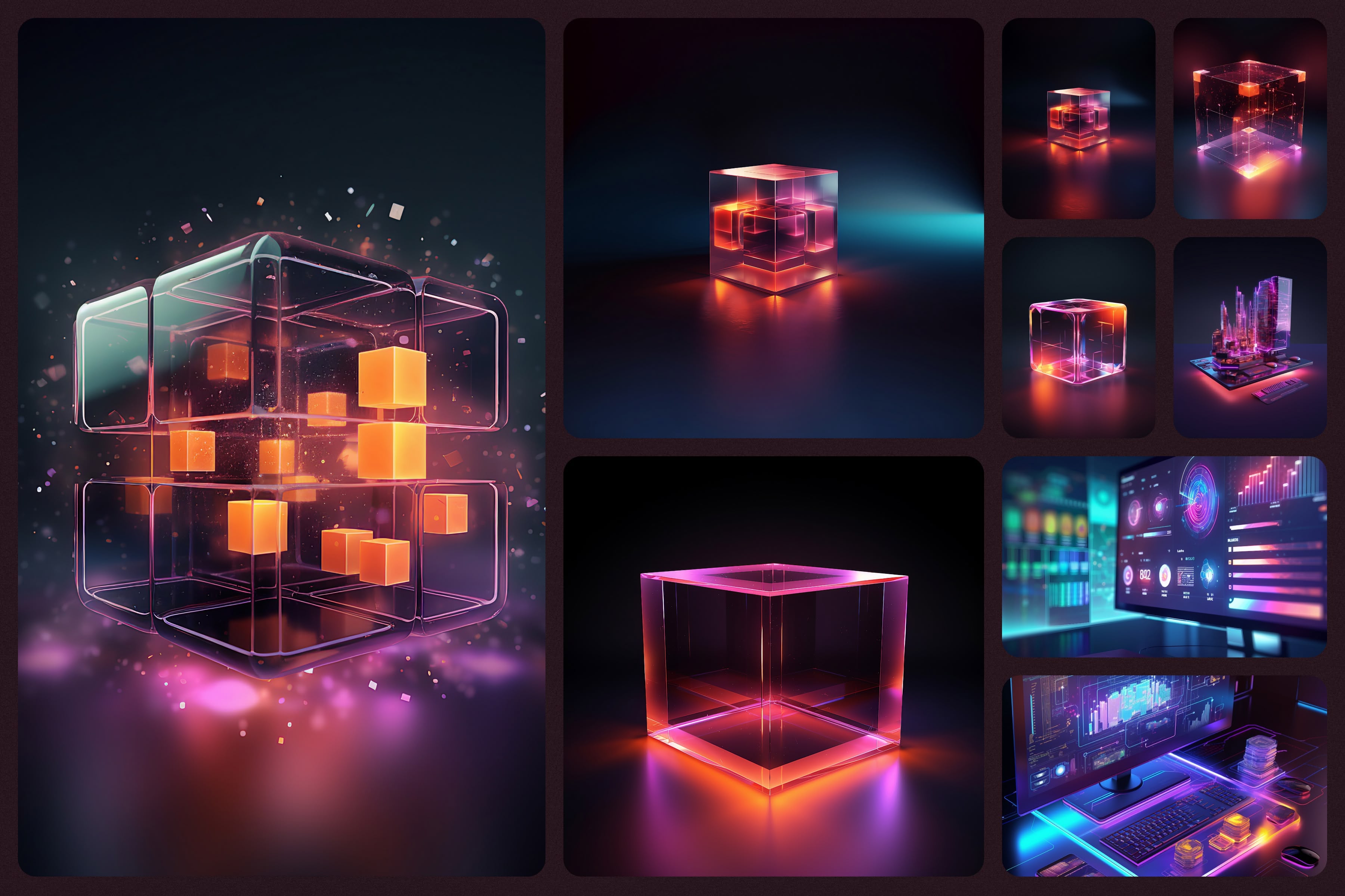
An AI-generated image library was created, designed to resemble technology building blocks and following Webmo's color scheme. These images were used as backgrounds on the website and in the updated Instagram carousel template.

An AI-generated image library was created, designed to resemble technology building blocks and following Webmo's color scheme. These images were used as backgrounds on the website and in the updated Instagram carousel template.

An image of a collage and mood board style layout of an AI image library sampling. - One image shows a cube that is abstract and technological with bits of technology surrounding it. - Another slide shows a glass-like modern cube with smaller cubes inside of it on a moody lit dark scene. - Another that is a clear technology cube with moody lighting and then two pictures of computer screens or computer technology that is very modern and futuristic. Each image has the color scheme of the lighting and color of the technology to match the Webmo visual design.

~ A.I. Image Library sampling.

~ A.I. Image Library sampling.

A digital brand style guide was created in Figma, giving Moin easy access to all brand assets and guidelines.


The style guide included:

  • High-level copy describing the brand strategy

  • Logo usage guidelines

  • Downloadable logo files

  • Typography guidelines

  • Color palette with hex codes, CMYK, and RGB values

  • AI-generated image library with prompts

~ See how I do style guides, and see Webmo's style guide.

~ See how I do style guides, and see Webmo's style guide.

Moin was also invited to the Figma file containing the Instagram carousel templates and digital style guide, allowing him to explore and implement them in his social media strategy.


Since implementing the new brand identity, Moin has reported increased engagement on Instagram and growing authority in his industry. The updated logo, color palette, and web design have been instrumental in helping him grow his business.

Moin Shaikh

CEO @Webmo

I'm not sure how I would have managed to create an identity for our company without Tim Preut's help.

The branding and logo that Tim created for us is perfect for our needs and it's made a huge difference in the way we look.

He was also very responsive, professional and extremely efficient.

A Ferrari Testarossa made of Legos sitting isometric top left on a solid yellow background with contrasted lighting and a soft shadow. White and yellow Legos and the Lego build is impressive.

hire me

I can’t wait to bring your vision to life. Here is how it works to hire me:

I can’t wait to bring your
vision to life, let’s do this.

👋🏼 STEP 01

Discovery, Hello, Nice to meet you.

We start on our journey together by hopping on a discovery call to make sure we are a good fit. I can learn all about your needs, and you can ask me any questions that you have.

👋🏼 STEP 01

Discovery, Hello, Nice to meet you.

We start on our journey together by hopping on a discovery call to make sure we are a good fit. I can learn all about your needs, and you can ask me any questions that you have.

👋🏼 STEP 01

Discovery, Hello, Nice to meet you.

We start on our journey together by hopping on a discovery call to make sure we are a good fit. I can learn all about your needs, and you can ask me any questions that you have.

🕵🏼 STEP 02

Define, Scope, Pricing, Lets Goo!

After our discovery session, if we're feeling good about each other, I'll develop a scope of work, pricing, and get you over an agreement. Then we can start working together.

🕵🏼 STEP 02

Define, Scope, Pricing, Lets Goo!

After our discovery session, if we're feeling good about each other, I'll develop a scope of work, pricing, and get you over an agreement. Then we can start working together.

🕵🏼 STEP 02

Define, Scope, Pricing, Lets Goo!

After our discovery session, if we're feeling good about each other, I'll develop a scope of work, pricing, and get you over an agreement. Then we can start working together.

🚀 STEP 03

Onboard, Set Tasks, Get rolling.

Once we become official in working together, I will onboard you into UpBase, which is what I use to manage our projects and setup some initial milestones and tasks!

🚀 STEP 03

Onboard, Set Tasks, Get rolling.

Once we become official in working together, I will onboard you into UpBase, which is what I use to manage our projects and setup some initial milestones and tasks!

🚀 STEP 03

Onboard, Set Tasks, Get rolling.

Once we become official in working together, I will onboard you into UpBase, which is what I use to manage our projects and setup some initial milestones and tasks!

Ok, lets get to work.

I can’t wait to bring your
vision to life, let’s do this.