Bridging complexity with clarity for a global audience.
I have been working with Sherex for the last 7 years on many UI/UX projects for their many apps. Because of that relationship they tapped me to redo their brand identity and website. I was thrilled, excited, and up for the epic challenge.
I kicked off the project with a Brand Strategy session with the CEO Teresa. After that meeting, I had my design Northstar ready, and my brain was calibrated to give Spherex some top notch design.
Global Design Mode
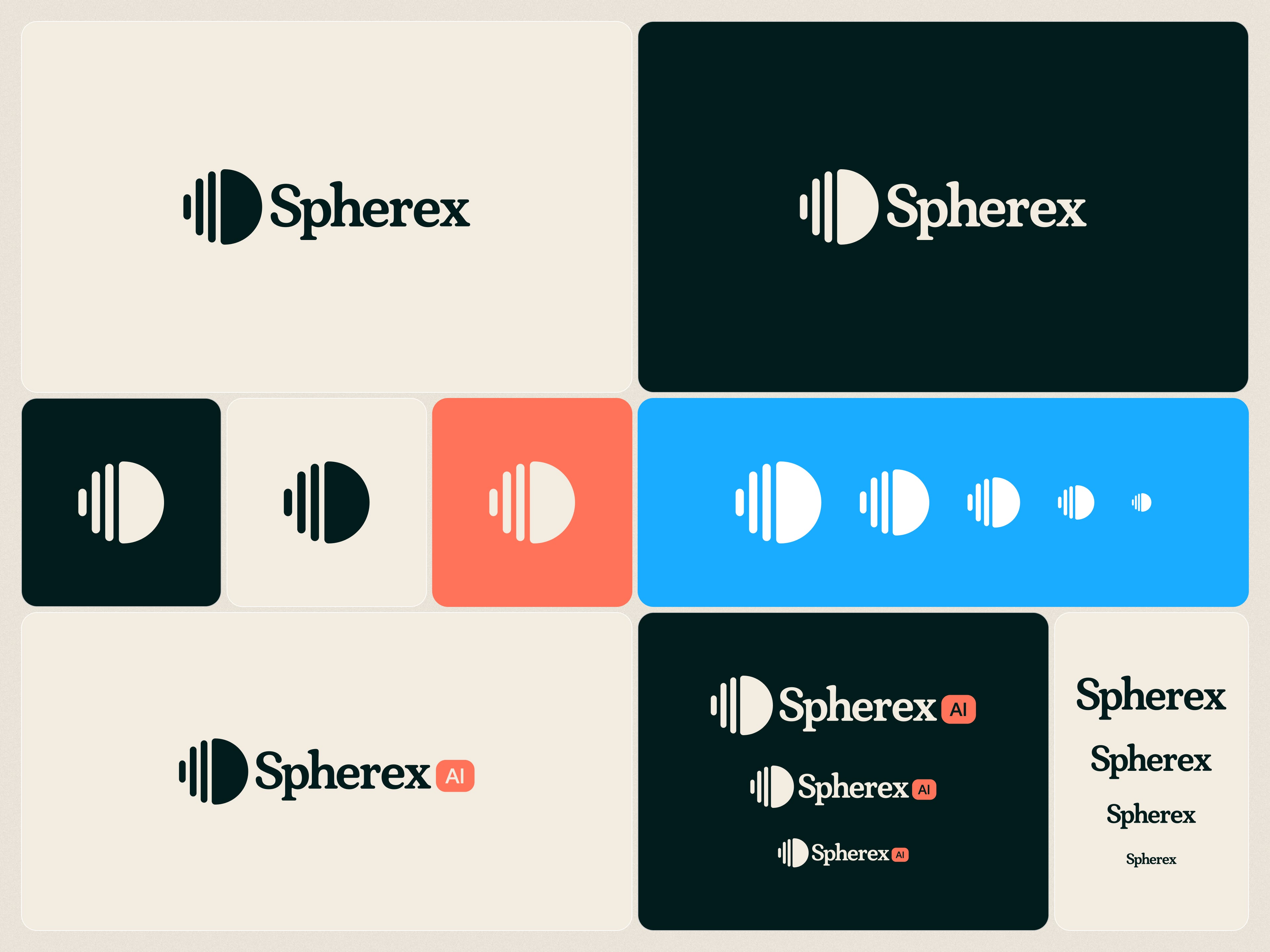
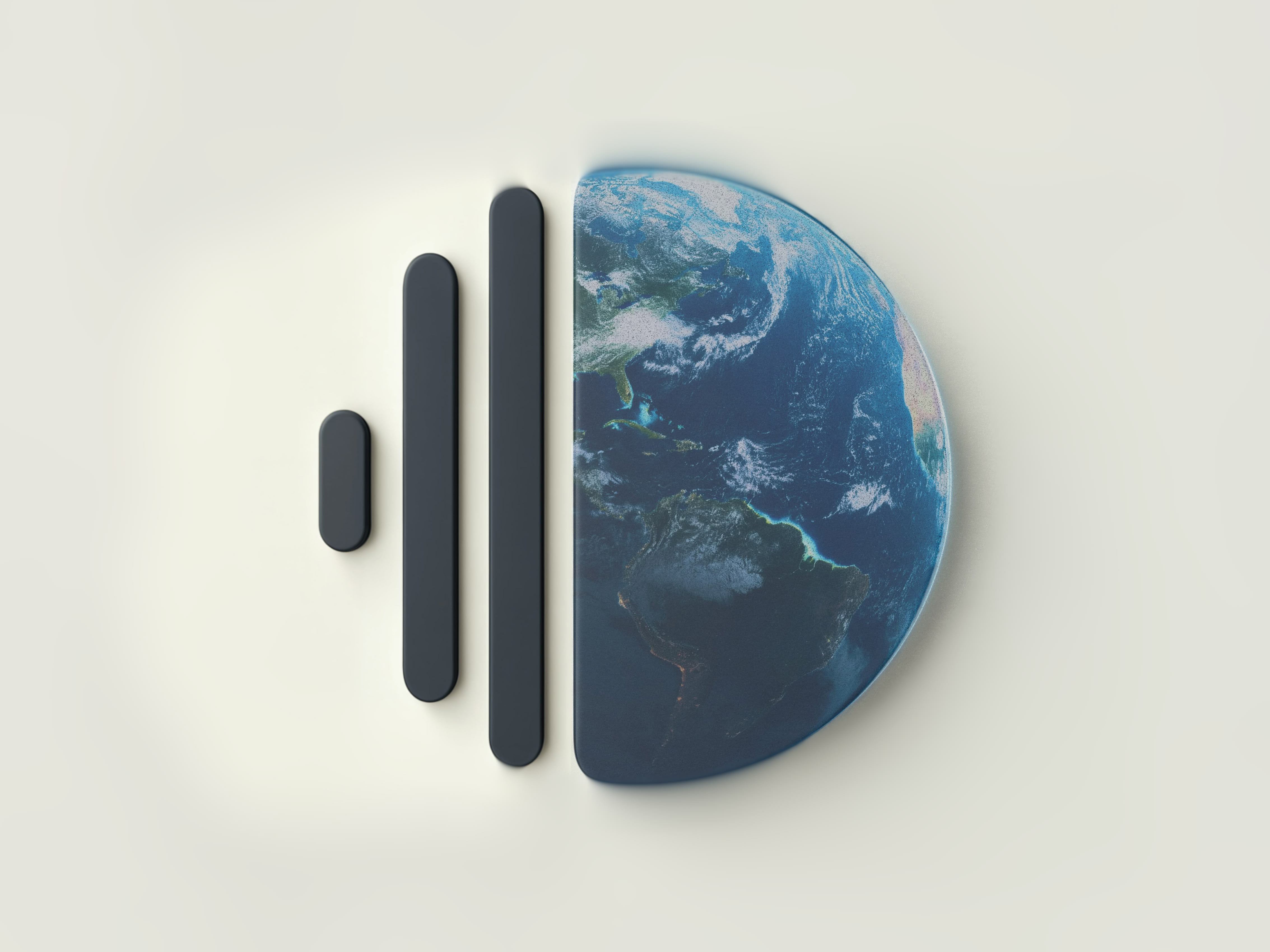
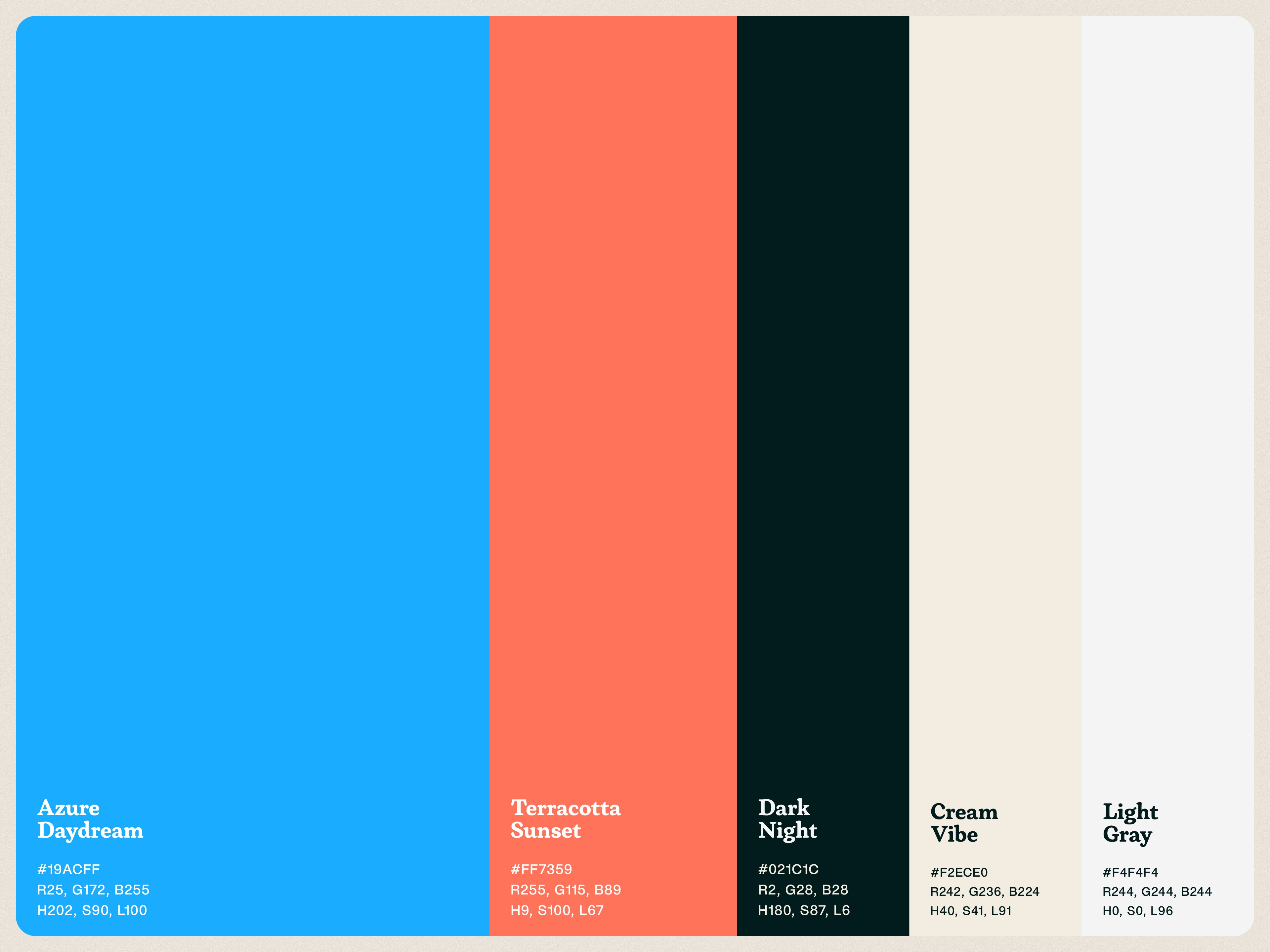
One of the key design languages I developed were conceptual imagery to communicate what Spherex does, on an emotional level. I did this by creating AI Images that mimiced movies and television shows, coupled with overlays of the app functionality to create a conceptual infographic. I coupled that with a logo mark that communicated the three pillars of Spherex's technology and its relationship to the global community. A color palette that was warm and tech 2.8.9.
The website and brand type are intentionally soft, techy, and human in feel. Integral to validating that Spherex is not another AI snake oil company, and set them apart from their competition.
Highlights
Website built in Webflow.
Custom filtering, searching, and sorting functionality on blogs and CMS content.
Job Application submission and job board.
Conceptual Infographic library
Tradeshow Banner
Style Guide