
← All work
This Work
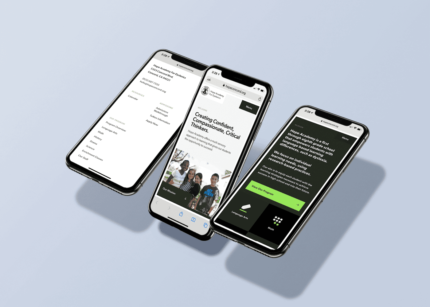
Hope Academy For Dyslexics
Tim Preut Design partnered with Hope Academy to create a responsive, accessible website that fostered emotional connections and achieved full enrollment for the school. Related How did the new website impact Hope Academy's enrollment numbers What specific accessibility features were included in the website design How did Tim Preut Design ensure the website was emotionally engaging What were the key branding elements refined in the project How did the website's design contribute to full enrollment
The Problem: Bridging Gaps in Communication and Accessibility
Hope Academy, located in Concord, CA, faced challenges in effectively communicating its mission and offerings to prospective parents, including those with dyslexia. They needed a website that would resonate with their audience while being accessible and easy to navigate. Additionally, their brand felt disjointed, lacking a clear strategy to connect with their community meaningfully. The project required Tim Preut Design to:
Understand the nuances of dyslexia to ensure inclusivity.
Avoid ineffective solutions like “dyslexia typefaces” without scientific backing.
Simplify content for clarity while addressing the needs of dyslexic parents.


The Solution: A Thoughtful Approach to Design and Branding
To address these challenges, Tim Preut Design implemented a strategic process:
Discovery and Define™ Session
Through Define™, Tim worked closely with Hope Academy to understand their goals, offerings, and audience needs. This led to actionable insights such as shortening their URL, planning a parent resource center, and refining content for impact.Design Strategy
Accessibility First: The website was designed with a modern, gridded layout to break content into manageable blocks, reducing cognitive overload for dyslexic users.
Typography Choices: Legible sans-serif fonts like Gibson and Covik Mono were selected for readability.
Warm Visuals: A warm color palette and textured elements were used to evoke trust and connection.
Prototyping: The design was tested in real-world scenarios using Invision to ensure usability.
Execution
Delivered a fully responsive website built on Webflow.
Integrated tools like Google Calendar and RenWeb for seamless enrollment processes.
Established a cohesive visual language through iconography, imagery, and textures.
The result was a welcoming digital presence that not only communicated Hope Academy’s values but also made information accessible for all users. This redesign significantly boosted the school’s visibility and engagement, leading to full enrollment for years ahead.